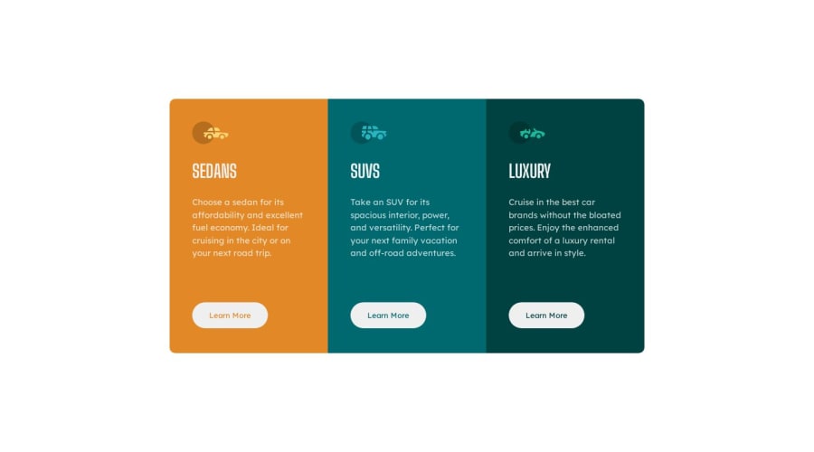
Design comparison
Solution retrospective
I recently completed a newbie challenge on FrontendMasters, diving deep into the world of CSS Flexbox. Before this, positioning items in dynamic layouts felt complex. Flexbox, however, transformed my approach, offering a streamlined method to align and distribute elements within a container. Through properties like justify-content, align-items, and flex-direction, I mastered the art of creating responsive and visually appealing designs. This wasn't just about grasping a theoretical concept; it was hands-on learning, giving me the confidence to tackle modern web design challenges with a fresh perspective.
Community feedback
Please log in to post a comment
Log in with GitHubJoin our Discord community
Join thousands of Frontend Mentor community members taking the challenges, sharing resources, helping each other, and chatting about all things front-end!
Join our Discord
