


@Jaykins1Submitted 29 days ago
What challenges did you encounter, and how did you overcome them?
feedbacks are welcome
Just general critique, thanks
Background gradient won't apply properly in all my projects. Specifically here upon removing an extension (display: none;) the document shortens and so background won't extend to the bottom of screen. However, if set body or html to height: 100% or min-height: 100% or combined variations, the gradient cuts to the height of viewport anyway.
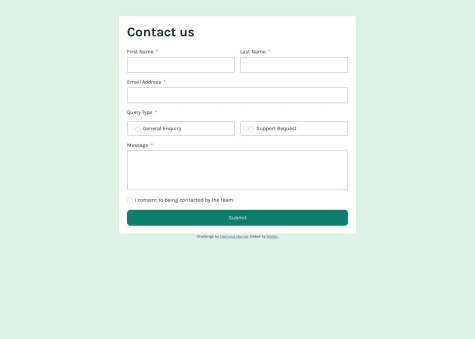
How to validate an email with pattern attribute in its element html tag? I tried to go this path first but then returned to good old JS regex. The patternMismatch didn't work.
General advice, thanks.
How to put the button over photos?
feedbacks are welcome
Yo, nicely put card but your images aren't showing because you haven't uploaded them in your github repository 😕
i'll take any advice !!
Hey, nice idea with the acrylic paint background and the card is made nicely
However, this background doesn't look that pretty from a phone because the picture looses quality on upscale and also because it becomes cropped to a certain area and user can't see paint flowing so it's harder to guess what's going on.
I suggest you to play with the image somehow. Like, cropping a smaller area in an editor in order to make alternative background for smaller screens or getting any other image of smaller scale.
The alt background can be made with media queries for example, like this:
body {
background-image: url(//your original image);

@media screen and (max-width: 350px) {
background-image: url(//another image for screens about the width of a phone in vertical position);
}
the thing where i'm the most proud, it's just when i finished and what i would like do differently the next time is review my table skills.
What challenges did you encounter, and how did you overcome them?the challenge I've taken up is with the table, as it's been a long time since I used the table tag, I've overcome using the div tag instead of the table tag .
What specific areas of your project would you like help with?I'd like someone to tell me whether I did well in the last section or not.
Hello, you did a good job however here's a few advice I'd like to give:
The table should be made with <table>, <tr>,<td>, <th> tags. Semantics are important for code readability and accessibility. Users with print disability use screen readers that navigate them through websites and those recognise the sections, buttons forms, tables etc. through the site html code. And you should keep that in mind.
Your work looks okay from my phone but on smaller screens it'll be a little irksome because the main card is too big and doesn't fit the vertical orientation, i.e. your site is not responsive. You should research @media css at-rule and build your projects with mobile-first workflow, i.e. first you code the style for little screens (for example, my phone width is about 350px width vertically) and then add alternative style code for screens wider than specific size using @media at-rule.
Specifically in this challenge I'd recommend adding a little margin to your taste to the .container class ao there's a small space between the card and the screen edges.
Think, that's enough. Continue your development, see how more experienced people solve these challenges and never give up 😀
Positive aspects of this project:
What I would do differently in my next project:
Challenges:
How I overcame the challenges:
I appreciate any suggestions regarding project structure and code improvements to enhance readability and ensure adherence to clean code principles.
This is a solution to the Blog preview card challenge on Frontend Mentor.
Users should be able to:
See hover and focus states for all interactive elements on the page.
DescriptionThis project involves building a blog preview card that closely follows the design provided in the challenge. The card displays an article's title, description, publication date, and author's avatar. The design includes interactive elements, such as a hover effect on the button and focus states on clickable elements.
The goal is to practice basic HTML and CSS concepts like semantic markup, layout techniques, and hover/focus interactions.
The design provided in the challenge includes both mobile and desktop views, and the layout needs to be responsive, with the card adjusting itself based on screen size. The card also includes an image, a button, and a footer with the author's avatar and name.
This project is deployed automatically using GitHub Actions to Vercel. The deployment process triggers whenever changes are pushed to the main branch of the repository. The GitHub Actions workflow installs the necessary dependencies, builds the project, and deploys it to Vercel, making it accessible online.
Links. ├── .github │ └── workflows ├── assets │ ├── fonts │ │ └── static │ └── images
To use this project, you can either clone the repository or download the zip files.
Clone the repository:
git clone git@github.com:ButrosV/frontend-experiment.git
Navigate into the project directory:
cd blog-preview-card
Install the necessary dependencies:
npm install
To view the project locally, run the following command to start the development server:
npm start
Then, open your browser and go to http://localhost:3000 to see the project running!
IMPORTANT: Ensure that you have Node.js and npm installed. If you run into any issues while setting up, feel free to reach out for support.
Through this project, I learned to implement hover states, manage responsive design, and effectively use Flexbox and CSS Grid to lay out elements.
Continued developmentI plan to improve the interactivity of the blog card by adding animations and further enhancing accessibility.
Useful resourcesA big thanks to Frontend Mentor for the challenge and all the resources they provided.
I am proud of successfully implementing a clean and responsive design while ensuring accessibility. The card layout adapts well to different screen sizes. Next time, I would focus more on optimizing the CSS structure and improving performance by reducing unnecessary styles.
What specific areas of your project would you like help with?I would appreciate feedback on my approach to structuring CSS—whether it’s efficient or if there are better ways to organize styles. Also, any suggestions for improving responsiveness, particularly for small mobile screens, would be valuable.


