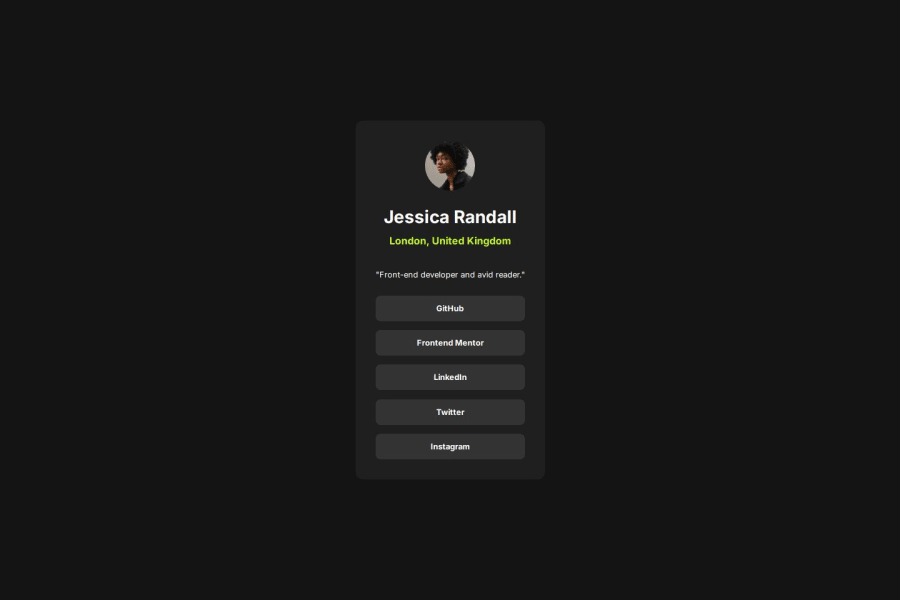


Design comparison

Solution retrospective
I am proud of successfully implementing a clean and responsive design while ensuring accessibility. The card layout adapts well to different screen sizes. Next time, I would focus more on optimizing the CSS structure and improving performance by reducing unnecessary styles.
What specific areas of your project would you like help with?I would appreciate feedback on my approach to structuring CSS—whether it’s efficient or if there are better ways to organize styles. Also, any suggestions for improving responsiveness, particularly for small mobile screens, would be valuable.
Community feedback
- @muhammadawaislaalPosted 2 days ago
you are future enterpenure
Marked as helpful0@asia272Posted 2 days agoThanks, Muhammad Awais! That means a lot! 🚀 I'm working hard to improve my skills and hope to build something impactful in the future. Appreciate the encouragement!
0 - @kunal90803Posted 9 days ago
Great Work @asia272 with clean code.. but i just notice a small mistake. As it is mentioned in the project to add focus mode also(I mean when we press TAB button it should also show effect) but in your case its default. So just add below code too.
.links li a:focus{
    background-color:var(--green) ;
    color:var(--black) ;
}
and just add transition while hovering to give a smooth effect
transition: all 0.5s ease-in-out;Other than that u did a great job. Best of luck for future ahead.
Marked as helpful0@asia272Posted 9 days agoThank you, @kunal! I appreciate your feedback and thanks for pointing it out!
0 - @DrMetrPosted 16 days ago
You provided wrong github link 😬
0@asia272Posted 16 days agoOops! My bad 😅 Thanks for pointing it out! I’ve corrected the link now.
0@DrMetrPosted 16 days ago@asia272 your code is clean, you checked all the requirements, and I have close to no remark. Well done :)
A few advices though.
-
Majority of experienced people here would point you to not to use px units and use vw and vh and other units instead.
-
I advice you to fill readme (the readme template, just remove the "template" word from the file name after). It allows you to organize your learning experience: you write down troubles you've encountered and then how you solved them and why the issue happened. The more you solve these challenges the more often you'll have to meet the same issues, and re-reading those readmes might help you a great deal if you keep them detailed enough. Also sometimes other users check them out so this way you'll be able to share your knowledges and resources.
-
Usually if <a> tag is supposed to be empty you can safely omit "href" attribute or type href = "#".
-
You can name custom colors in the css file like this:
:root {
    --green: hsl(75, 94%, 57%);
    --lightgray: hsl(0, 0%, 20%);
    --grey: hsl(0, 0%, 12%);
    --black: hsl(0, 0%, 8%);
}
And then use them further like that:
p {
color: var(--grey);
}
Marked as helpful0@asia272Posted 16 days ago@DrMetr thank you for your valuable feedback! 🙌 I have updated my project by using rem, %, and vh/vw for better responsiveness and also implemented CSS variables for consistent styling. Your suggestions helped me improve my understanding of flexible layouts. Really appreciate your insights!
1 -


Please log in to post a comment
Log in with GitHub
Join our Discord community
Join thousands of Frontend Mentor community members taking the challenges, sharing resources, helping each other, and chatting about all things front-end!
Join our Discord