@tarekulSubmitted 5 days ago
What challenges did you encounter, and how did you overcome them?
I was challenged by using CSS Flexbox to vertically and horizontally center the card component.

I was challenged by using CSS Flexbox to vertically and horizontally center the card component.
Hey, good solution 😉.
I have a little tip for you. In most cases you don't need a media query for cards, like in this case.
Add these lines to the classic .card and it should have the same effect.
margin: 1rem;
max-width: 350px;
With these two lines you have made the card responsive for all devices. The max width means that the card cannot get larger. The margin, in contrast, is the distance to the edge of the screen when you make the browser window smaller. Now you can delete the media query.
I hope I could help you
Happy coding 😊
Hey 👋, i like your solution.
Maybe you forgot to center the card vertically. To center the card give the main element a height of 100dvh. Then can you center it. I like to use grid but you can use flex as well. With display grid you say that all elements in the main tag are grid children. For centering (vertically and horecontely) you use place-items center.
The style which you can add to your main tag:
main{
    display: grid;
    place-items: center;
    height: 100dvh;
}
Happy coding 😉
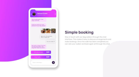
The use of pseudo-code ::before and ::after helped me to add content like accent designs and radio button for the choices in the message container.
The snippet below will show how I did the styling for the mockup radio button
.time:before {
  content: '';
  display: inline-block;
  height: 1rem;
  width: 1rem;
  border: 0.1rem solid var(--radio-btn);
  border-radius: 50%;
  margin-right: 0.5rem;
}
I was hesitant to do the phone app but I discovered to make a container that will have respective divs for every element and class to style each individual properly.
Hey, good soluten.
I have two points for improvement:
main{
      min-height: 100dvh;
}
I hope i could help you to improve your skills. 😉
Happy coding 😊
I am proud that I was able to do this without any frameworks as I have been struggling a bit with plain css. I would like to use frameworks like bootstrap or tailwind css next time.
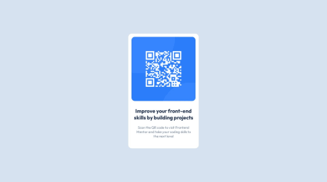
What challenges did you encounter, and how did you overcome them?I could not center the qr code elements to the center of the page. I managed to center it horizontally using flexbox but failed to do so vertically.
What specific areas of your project would you like help with?Centering of components on the page for it to also be responsive on mobile screens
Hey, good soluten but i have some points for improvment.
height.body {
min-height: 100dvh;
}
min function, it will always use the lower width. When the width of the screen is lower than 350px the card get a width of 90dvw. (Learn about the min function)#container {
width: min(350px, 90dvw);
}
aspect-ratio. Lastly i center the image with margin. (Don´t forget the display: block; for it)img#qr-code {
/* position: relative; */
/* margin: 17px; */
aspect-ratio: 1 / 1;
width: 90%;
margin: 1rem auto;
display: block;
}
I hope i could help you to improve your skills. 😉 Happy coding 😊
Hey, good soluten but i have some points for improvment.
grid . Then i have to to say that every element in the grid container should be centered verticaly and horicontaly. Normaly every adult container has the height of all the children. We want the full theefore we use height (you can use min-height) too. 100dvh is the full height of the screen without the searchbar.body{
display: grid;
place-items: center;
height: 100dvh;
}
gridcentered the card in the middle of the screen, therefore we didn`t need the margin anymore. Never declare the height, because when the headline or the paragraf is longer the content overlaps.* Instead of using pxuse the min function. It means when the screen is widther than 350px the width is equale to 350px. When it´s no widther than 350px it´s 96dvw of the screen width. (The min function makes it easier to make websites responsive. 😉).back{
/* width: 300px; */
/* height: 450px; */
/* margin: auto; */
padding: 10px;
width: min(90dvw, 350px);
}
aspect-ratio to make the width and the height the same. And again it´s responsive 😉.img {
border-radius: 20px;
/* width: 280px; */
/* height: 280px; */
aspect-ratio: 1 / 1;
width: 90%;
}
div with the img in it. This is how I would set it up <section>
<img src="PATH" alt="TEXT" >
<h1>TEXT</h1>
<p>TEXT</p>
</section>
Maybe it helps you to see my solution of the challenge.😁
I hope i could help you. Happy coding 😊
I would like to get any advice on how I can improve my CSS code as well as help on how to add the border to the card when the view is for the computer.
Hey good solution.
Small suggestions for improvement:
// ------------------------------------- remove ------------------------
@media screen and (min-width: 768px){
     .card__puntuation {
        // height: 90%;
       }

       .card__summary {
         // height: 90%;
         // padding: 60px 20px 60px 0px;
// -------------------------------------------------------------

       // the shadow
         box-shadow: 0.5rem 0.5rem rgb(0 0 0 / 10%);
         border-radius: 2rem;
        // end shadow
       }
}
// ------------------------------------- remove ------------------------
.card__puntuation {
   //  height: 50%;
}
// -------------------------------------------------------------
Happy Coding 😉
Small improvements:
HTML:
<img src="images/image-qr-code.png" alt="myIMG"/>
CSS:
.container{
    width: min(300px,90dvw);
}

img{
    width: 100%;
}
Happy coding 😉
A short and enjoyable little challenge!
Hey, good soulution.
If you use min you can pass multiple values and the smaller one is always taken. The unit dvw is dynamic and indicates the width of the browser. So it's 90dvw from the screen. If this is larger than 310px, the px will be taken.
Alternatively, you could give the card a margin on the mobile version.
.main-card {
    width: min(310px,90dvw);
}
Happy Coding 😉
Hey, good solution.
You don't need media queries instead use width: min(90dvw, 350px); and keep your CSS shorter.
.card{
     width: min(90dvw,350px);
}
Happy Coding 😉
The development of the NFT card, written in HTML and CSS
Hey good solution.
Small suggestions for improvement:
min function always uses the smaller value and this gives you a distance when viewing the mobile phoneobject-fit you can prevent your images from distortingThe improved CSS:
.card-nft{
    width: min(375px, 90dvw);
}

img{
    object-fit: cover;
}


/* possible solution for the turquoise background: */
.card-nft-header {
    position: relative;
    transition: .75s all;
}

.card-nft-header::before {
    width: 100%;
    background: var(--primary-cyan);
    top: 1px;
    height: 100%;
    position: absolute;
    border-radius: 1rem;
    content: "";
    opacity: 0;
}

.card-nft-header:hover::before {
    opacity: 1;
    transition: .75s all;
}
Happy Coding 😉
First project.
Hey, you forgot to upload the image to github.
Happy coding 😉
Hey, good solution.
Some improvements:
body tag a height of 100dvh (is the whole screen height)img tag a width of 100% to cover the entire widthp tag is no longer on the card (.barcode-container). Either you remove the height or you give it the value min-contentThe improved CSS:
body{
   height: 100dvh;
}

img{
    width: 100%;
}

.barcode-container{
   height: min-content;

   /* use this to have a border in the phone view */
   width: min(300px, 90dvw - 40px);
   /* or */
   box-sizing: border-box;
}
Happy Coding 😉