@srjuchenkoSubmitted about 2 months ago

casper pelsma
@Casper-pelAll comments
- @Casper-pelPosted about 2 months ago
I did you did great on this challenge. For the ordered list i would recommend using some margin between numbers and the text itself as it looks cleaner that way. You structured your code really well and tackled some problems differently from how i did, but better in my opinion. That is deffinetly something i will keep in mind for future challenges.
Great job, keep coding
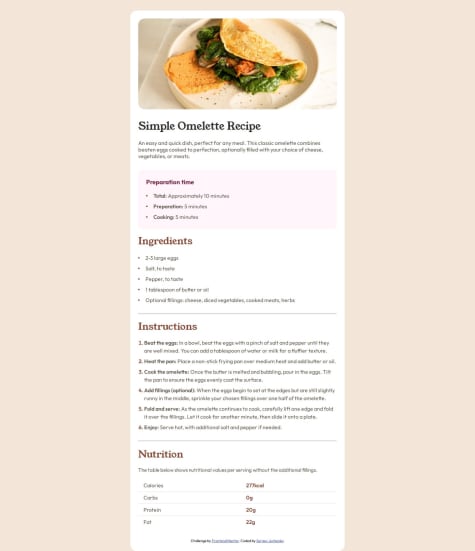
0 - @imaginarygardenSubmitted about 2 months ago@Casper-pelPosted about 2 months ago
I really like it. it looks very similar to the given design. the font-sizes and margins are very well chosen too.
personally i chose to use a ul for the "buttons" as it was a bit easier and cleaner in css. using buttons works too but i would recommend you try using ul the next time round.
I also like how you made the site responsive as everything shrinks smootly with the devices width. I would recommend leaving some margin around the card on the small devices as it will give your site a much cleaner look
Marked as helpful0 - @adolfin07Submitted 2 months agoWhat are you most proud of, and what would you do differently next time?
interesting
What challenges did you encounter, and how did you overcome them?none
What specific areas of your project would you like help with?none
@Casper-pelPosted about 2 months agoit looks good, the width could have been more like the given desing as it looks cleaner that way.
I wanted to have a look at your code, but unfortunately i got an 404.
great job, keep Coding
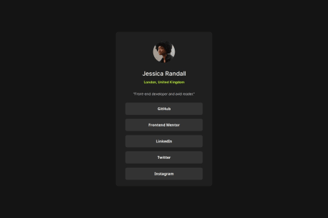
0 - @DimitriTsikaridzeSubmitted over 2 years ago@Casper-pelPosted 2 months ago
Nice clean and compact code. Size differs slightly but isnt a big deal. Margins and padding look good aswell
great job
0