@rebecanepomSubmitted 12 months ago
Please, tell me how I can improve!

Please, tell me how I can improve!
Hey, you do it great!
Just some feedback: In your style.css, line 11, you have a margin for the body. Use this
body {
background-color: hsla(207, 44%, 81%, 0.5);
margin: 70px auto;
}
instead of this: body { background-color: hsla(207, 44%, 81%, 0.5); margin: 70px; }
Auto will center your content in horizontal axe.
Next. If you want to improve your HTML, you can change the section for main because is your main content. And the p class= "p1" for h1 class="p1". This'll make your site more accessibility for people that use other equipment to read your site.
You can read more about this here: https://developer.mozilla.org/en-US/docs/Learn/Accessibility/HTML
I hope helped you. Greetings.
I only use my eyes measures, for all the gaps and the width of the component. Im trying to get more practice with css-grid. This component is very simple and the align technique can be different.
Excellent Job!
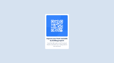
Just remember to use a <h1> heading instead of the <h3> heading that you use. Remember that some people have no vision so if you put this <h1> heading that'll improve the accessibility of your web page and that will improve the SEO. This is because the lector will read first the <h1> heading.
Greetings!
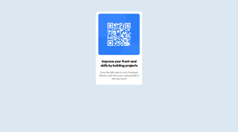
Hi, I like the shadow effect that you use. Just remember to use a heading <h1> for the text "Improve your front-end skills by building projects" instead the <h3> heading. And use <main> instead <div class="card"> that you use, that will improve the SEO because you improve the accessibility of your webpages.
¡Excelent job! Greetings.