Submitted over 1 year ago
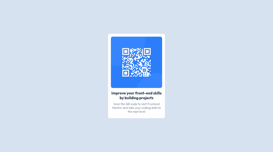
HTML-CSS qr-card-component, centered with css-grid.
@CodeRaxLive
Design comparison
SolutionDesign
Solution retrospective
I only use my eyes measures, for all the gaps and the width of the component. Im trying to get more practice with css-grid. This component is very simple and the align technique can be different.
Community feedback
- @Camoralesh27Posted over 1 year ago
Excellent Job!
Just remember to use a <h1> heading instead of the <h3> heading that you use. Remember that some people have no vision so if you put this <h1> heading that'll improve the accessibility of your web page and that will improve the SEO. This is because the lector will read first the <h1> heading.
Greetings!
0
Please log in to post a comment
Log in with GitHubJoin our Discord community
Join thousands of Frontend Mentor community members taking the challenges, sharing resources, helping each other, and chatting about all things front-end!
Join our Discord
