Not Found
Not Found
Not Found
Not Found
Not Found
Not Found
Not Found
Not Found
Not Found
Not Found
Not Found
Not Found
Not Found
Not Found
Not Found
Not Found
Not Found
Not Found
Not Found
Not Found

All comments

  • @joshD90

    Submitted

    I enjoyed this one although I thought it would be much simpler than it was.

    Questions

    • Do I need to concern myself with the site looking perfect at every dimension possible, eg. 768px, 920px, 1100px, 1500px... or is it industry standard to focus on the primary breakpoints?
    • For the longest time I didn't realise there was a desktop scaled image that worked much better with my CSS-grid, and before realising this I was struggling to get the image to dynamically fit the grid row and height however couldn't find how to do this anywhere online to my satisfaction.
  • @javascriptor1

    Submitted

    Hello everyone 👋, I'm Mohammed and this is my solution to this nice challenge.

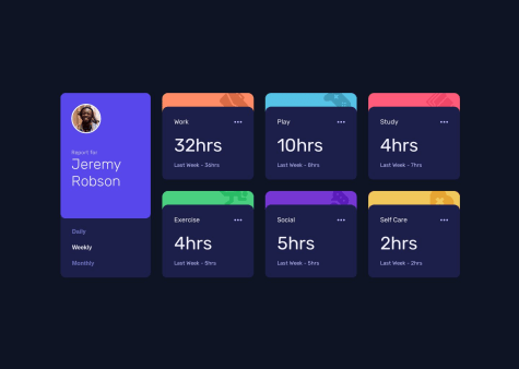
    Starting from this challenge, I decided to stop using Flexbox for the general layout of all future challenges. Instead, I will use CSS grid as I need to practice and do more exercises on CSS grid to improve.

    I will briefly talk about my current process of solving FEM challenges and I hope it will help and inspire other beginners(like me 😊). To make this process actionable so others can follow, I will list the steps I take to solve the challenge:-

    1- I download the challenge resource file and extract it in a special folder 📁 so I can use it in the future if needed without having to re-download it again.

    2- After the files were extracted, I read 📖 about the requirements to solve 🤔 the challenge.

    3- After reading the requirements, I open the design folder to see the final product both for mobile and desktop screens. I also note down the number of active state elements so I don't forget to do it while solving the main challenge.

    4- After I see both photos for screen designs, I take some notes 📝on how best to do the HTML markup and how to structure the elements in the page. This is very very important ⚠ issue and help in later steps. I pick up best semantic tags which serve the purpose of the content.

    5- I then create a css styling and javascript files , link them to the html file then I initialize a new git repo and make initial commit on the master branch.

    6- Then I do the actual markup of all texts in challenge file for mobile screens. for example , if a text is best displayed as H1 tag , I wrap the text in h1 tag using a shortcut in vscode,etc.. I also add images and icons at this stage. then I create a new git branch for mobile-design before I start styling.

    Note : I always do mobile-first solution and I don't combine mobile and desktop styling at same stage.

    7- After I finish the markup stage , I go to styling stage targeting mobile screens. I use live server on vscode , I go live and open the page in my chrome , then use Pixel perfect extension to load the design file for mobile screen as overlay on top of my actual page. I make sure the overlay image is exactly 100% on top of my html page. I make sure I choose the right screen resolution which is 375px.

    8- At this stage, I use Responsively app to see how the page will look like on different screen sizes. I usually have the following screen sizes opened at the same time:

    • Iphone SE 375px Fem design size for mobile
    • Iphone Pro Max 428px
    • Ipad mini 768px
    • Ipad Air 820px
    • Ipad Pro 1024px
    • My own screen size 1366px
    • MacBook Pro 1440px Fem design size for desktop

    9- After I finished mobile screen design , I commit all changes, checkout to master branch , then merge mobile-design branch with master created before.

    10- I then create a new branch for desktop design , load the design image as overlay on chrome using the extension and I start coding on custom screen size of 1440px I created for this purpose.

    11- I repeat step 9 with desktop branch.

    Note : I will add a new git branch in future for accessibility,SEO and performance so I improve this area also.

    12- I move to Javascript part of the challenge after I create a new git branch for it.

    13- After I solve the javascript part , I commit and merge into master branch and my solution is ready for deployment.

    14- I do final checks to make sure all things are working as it should , then I deploy to netlify.

    15- I then upload my solution to FEM website

    This is a brief process overview I developed over time. I'm know its not perfect for sure but its good start for a beginner like me with big room for improvement in future.

    This process does not take into account frameworks or libraries I might use in my solution. In case I did use such frameworks (like tailwindcss for example), I install them at initial stage.

    Built with 🛠

    What I learned 🧐

    • CSS grid for general layout of the project
    • working with json files to import data and update the DOM

    Continued development

    • Working with CSS grid
    • Fetch, JSON in Javascript
    • Pass arguments for callback functions with addEventlistner

    Useful resources

    Acknowledgments

    This work was inspired by the solution of Melvin

    Callie 170

    @Callietron300

    Posted

    Really enjoyed reading your process, thank you for sharing ♥️

    Marked as helpful

    1
  • @mariahw4

    Submitted

    This is my first submission of a project on this platform and I would welcome feedback!

    I found it difficult to adjust the size and placement of the circle element and would appreciate input or suggestions on how to do it more smoothly.

    I feel like I needed to create too many classes to properly get all the text sizes and colors and formatting done properly, so again would love feedback on ways to slim down my code.

    Thank you!!

    Callie 170

    @Callietron300

    Posted

    Hey! I can see some people have already left comments,

    For helping you center things I would recommend using flex a bit more, have a look at my solution as I used flex to center a lot of my element, you might find it useful.

    When it comes to classes I used to be the same too, but ill be honest it looks like you've done a great job. Theres this method called BEM I learnt about it when I was following this course teaching me SASS and the two go hand in hand quite well. Id really recommend the course if you have a good grip on basic CSS and are looking to clean up your work and learn some best practices.

    For sizing i'd also look in REM, this video taught me some great stuff about units and I find rem really useful in setting the right size.

    I hope this is helpful- pls upvote my comment if it was (i get points lol)

    Marked as helpful

    1
  • Callie 170

    @Callietron300

    Posted

    Hey! Apologies, but i was interested in your issue but realised I don't quite have all the knowledge to solve your problem. But I think I've managed to work out what the issue is and some potential solutions :)

    In your container element you have a set height, however at a viewport width below 1000 your grid collapses into a column but it keeps the height: 400px which is what is causing the summary box to keep that same height and cutting your background short.

    I have a feeling if you fix your grid declarations that could be the solution. Or it might have something to do with which elements you are setting height for. An easy fix would be to use a media query to set the height to auto in your container for viewport widths below 1000.

    Sorry I cant give you a proper fix but i hope this helps you find a solution! I gave this a go a few weeks ago and was quite happy with it if you are interested. But i didn't use any grid! (pls upvote my comment if it helped you!)

    0
  • @februaryfourth

    Submitted

    I enjoyed this project but sometimes i felt i was using the wrong methods for positioning elements. Would love to get some feedback on how you would have positioned the elements differently.

    Thanks in advance!

    Callie 170

    @Callietron300

    Posted

    Hey, I had a look at your code after seeing your comment, I think you've used flex how I would! I'm only about 6months in but I can't work out anything I would change flex wise, so I think you have it right! I also wanted to compliment your labelling of classes all super clear. I think if you had to be picky the only thing I noticed was the padding at the bottom of your text container which added extra padding to the bottom so solve this you could just use padding-top.

    0
  • Callie 170

    @Callietron300

    Submitted

    Tried a bigger project, I got a little confused in some sections but feel like I am slowly making progress. There are a few areas that I would massively appreciate some feedback on.

    I used the figma file for font sizes however I found it hasn't helped make a replica design. I think I've had more success in guessing rems by eye.

    **Things I'd love feedback on: **

    • I can't stop the page from showing the overflow on the right from the offset pictures at the top- you can see there's a little margin on the right hand side where the overflow is showing. When I set overflow to hidden you lose most of the webpage so i don't think that is the correct fix.
    • my btn is taking up the full width of the column and I can't workout how to fix this- it's only an issue in the desktop view
    • I struggled to add margins for my hero-text element- I created a margin class to add the margin in. Is there a better solution for this?

    Time taken to complete: 6/7hours

    Callie 170

    @Callietron300

    Posted

    I actually just realised how to fix my overflow issue- if I add overflow: hidden to my hero box instead of the body!

    0
  • Callie 170

    @Callietron300

    Posted

    Hey this is my first time giving feedback, I think it looks so great; these are just a few things I noticed in your code that will help it look even better:

    • Your section with the class name 'bottom' the corners need rounding
    • when looking at the different breakpoints between 480px & 768px the attribution element is pushed to the right-hand side - i think you could fix this by adding flex-direction: column; for that media query.
    • when viewing at widths smaller than 768px there is the padding on the body that prevents your element from sitting nicely against the sides of the screen. removing the padding will fix that!
    • also if you also declared some widths for the two elements for the desktop view it would stop them from stretching really wide for larger screens.

    Feel free to have a look at my solution and tell me any of your thoughts! <3

    Marked as helpful

    1