Bismeet singh
@BismeetSinghAll comments
- @skarthikeyan96Submitted over 2 years ago@BismeetSinghPosted over 2 years ago
Hi, you have a lot of html validation issues, I <strong> think </strong> you should have a look at them.
0 - @EbasitaSubmitted over 2 years ago@BismeetSinghPosted over 2 years ago
Hi, you have a lot of html validation issues, I <strong> think </strong> you should fix them. Also, your color on the card looks vastly different from the required design.
Marked as helpful0 - @JT1974Submitted over 2 years ago
How much do you break your code into smaller files/components? Is it worth to bother with too many components on this level of complexity? Reviews of my solution and code are greatly appreciated. Thx
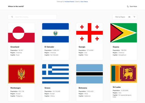
@BismeetSinghPosted over 2 years agoHi, shouldnt there be a way to go directly from a country specific view to the home view directly, instead of clicking the back buttons dozens of times, once I am very deep into the hierarchy, I dont know whether its part of the challenge, but I just felt that from a user perspective and I couldnt find any. Alternatively, we could also do breadcrumbs that allow the user to jump anywhere in the so far navigated hierarchy, just my 2 cents.
Marked as helpful1 - @eslammohamedtolbaSubmitted over 2 years ago
I am happy to discuss my design with you, All feedback and questions are welcome
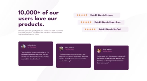
@BismeetSinghPosted over 2 years agoHi, this doesnt seem to be responsive at all for a mid sized screen. Maybe a media query for somewhere around 700 px will help you. Currently, the rating cards become vertical and the testimonials are overlapping with them.
0


