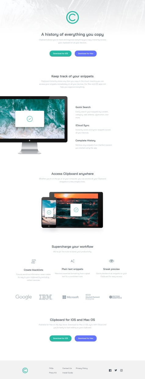
One section that I can't seem to figure out is how to perfectly center align the three columns under "Supercharge your workflow". I tried every kind of alignment (content, items, justify, self), but the first column is a couple of pixels lower. Grrr.
Blagoj
@BagataaAll comments
- @ryanthayesSubmitted over 1 year ago@BagataaPosted over 1 year ago
Hello, congratulations on finishing the challenge, I reviewed your code and I fixed it by adding a height on icons now it's perfectly aligned. The first icon has an 88px height the other 2 icons are 80px height you can change the first item to 80px height and it will be perfectly aligned. I hope this helps you. HAPPY CODING
Marked as helpful0 - @YannickMukengSubmitted over 1 year ago
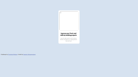
I defined the body of my document as a "flexbox" and used padding to center my qr-code. Was there an easier way to get my qr-code in the center? So yes, how? My images also disappear when I upload it live, what do I have to put in my code to avoid this?
@BagataaPosted over 1 year agoHey, you can easily center your card with Flex. In the body element, you should give height:100vh body { display: flex; justify-content: center; align-items: center; height:100vh } And you must delete the padding from the body you don't need it. Tip: U don't need flex-direction: row, By default, the flex items are placed in the row direction. HAPPY CODING
Marked as helpful3

