Hi, you did great in this challenge, what I can suggest about responsiveness is to make the width in the main class in the media query auto width: auto;, and also try small font sizes.
Hi, your solution is very good, you did all the design requirements very well, one you forgot is when you are on a smaller viewport you will notice that your design starts touching the edges of the screen, what I suggest you do is add padding to the body element to have vertical space in all small devices.
Hi, you did a great job in implementing this project, the frustration you have I also have it, I don't know about an efficient way but I recommend you to read my code solution for this problem, it doesn't solve your problem but it reduces the amount of code you write, here is the GitHub link: Github.
also, you forgot to add a cursor pointer to your button.
Hi, you did a great job in your challenge almost all the required design elements are present, except the background image, this later needs to be on the edges of the screen in all screen viewports if you want to see I mean go for larger screens and you will see margin around the bg-image, the solution to this problem is by using position absolute in the figure element and some changes to the element, here's a simple solution to this problem:
The picture element should have this code:
    position: absolute;
    top: 0;
    left: 0;
    width: 100%;
img tag inside the picture element should have this code: width: 100%;
if you have a problem in the srcset, I recommend you to read this article about it srcset
Hi, you did a great job on your challenge, one thing I can suggest is to center your design horizontally on the screen, you can do achieve this by adding this code to your body element:
    min-height: 100vh;
    display: flex;
what this code does is make the body height identical to the screen height which gives you this desired effect.
foi um projeto legal de se fazer, acredito que eu posso melhorar muito mais na questão de organização do css, das class entre outros, gostaria que vocês dessem a opinião sincera de vocês onde eu poderia melhorar...fico grata!
Hi, you did a great job on your challenge, and the effects you added are nice it gave you more creativity in your project, one thing I can suggest is to center your horizontally in the screen, you can do it by adding this code to your body element min-height: 100vh;, what this code does it make the body height identical to the screen height which makes you this desired effect.
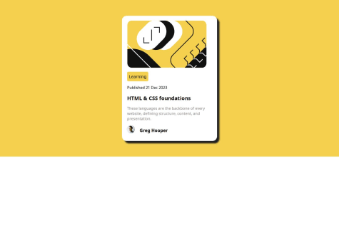
I would greatly appreciate any feedback you may have on my QR code component solution. Please feel free to point out any mistakes or areas that could be improved. Your input is incredibly valuable to me, and I'm eager to learn from any constructive criticism you can provide. Thank you in advance for taking the time to review my work.
Hi, you did a great job in your challenge, I would like to point out one edit you need to do to refine your solution, which is that when you go below 375px in the mobile viewport you will notice that the card starts touching the edges of the screen, I suggest you add padding in your body element, one more thing is that the width you specified in your container will make you some problems you should delete it, also the background-color will be best put in the body instead of the container because when you go on a smaller screen the container will not cover the entire screen with the bg-color.
EDIT:
After reviewing your code, I observed an aspect that could hinder your design's responsiveness: the fixed width you specified for your image. Even if you implement the previously mentioned suggestions, you might encounter responsiveness issues. I recommend consistently using max-width instead. In your scenario, consider using max-width: 100% and removing the explicitly declared height. This adjustment will enhance the responsiveness of your design.
Hi, you did a great job in your challenge, I just want to add that when you go for smaller screens your design starts to crashes and the culprit is the height you specified in the .container1 class, I think you should replace it with min-height: 100vh;
Hello, your solution is very well defined, I only want to add a small change to make your solution more refined. in the mobile viewport when going less than 375px your main element starts touching the edges of the screen, I think you should add padding in your body so that it can never touch the edges.
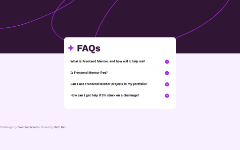
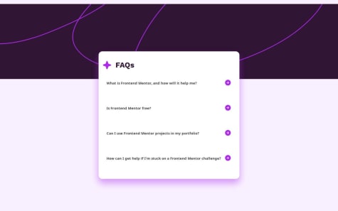
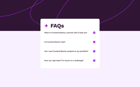
you did a very good job in this challenge there is nothing to add, but just a small thing I think you forgot is in the mobile viewport the design has a margin-top in the faq section which is the main section in your code, also I have a suggestion to make the challenge even challenging is that when you click to expand the answer all the other opened questions should close, just a small function but it can be tricky.