Skip to content
Learning paths
Challenges
Solutions
Articles
Unlock Pro
Log in with GitHub
Profile
Overview
Solutions
3
Comments
0
Aleksei Kovalev
@AlekseiK412
Follow
All solutions
Submitted almost 2 years ago
Responsive news homepage with CSS Grid
HTML
CSS
JS
1
4
0
Submitted about 2 years ago
Responsive notifications page using ReactJS
HTML
CSS
JS
0
3
0
Submitted over 3 years ago
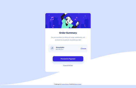
Responsive order summary card using CSS Flexbox and CSS Variables
HTML
CSS
2
1
0
