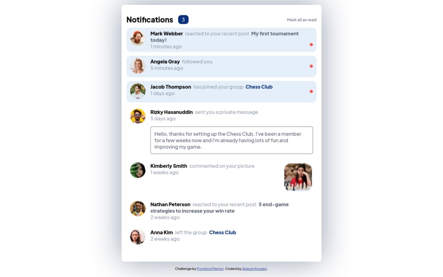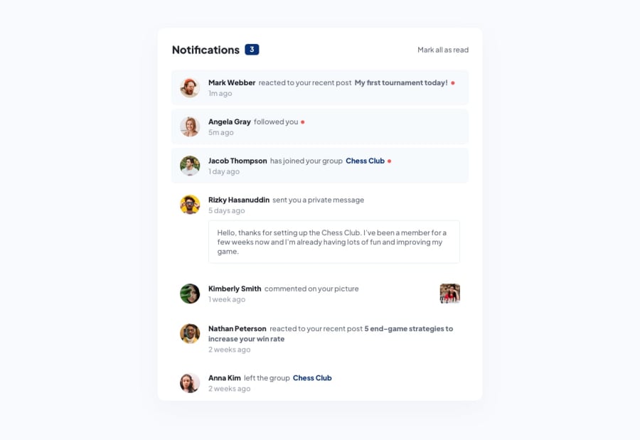
Responsive notifications page using ReactJS
Design comparison
Solution retrospective
I recognize that this is not the best or most optimal solution, but I didn't want to spend too much time thinking about that and just did what I thought was ok at the moment, however any constructive criticism is welcome. The main issues I find with my solution is the big clutter in the Notification component that I could've split up, and the getConvertedTime function could be better by accounting for edge cases as well as changing the measurements ("minutes", "hours" etc.) to singular/plural when needed. And if there is anything else you notice that could be improved, please do tell, your feedback is appreciated.
Community feedback
Please log in to post a comment
Log in with GitHubJoin our Discord community
Join thousands of Frontend Mentor community members taking the challenges, sharing resources, helping each other, and chatting about all things front-end!
Join our Discord
