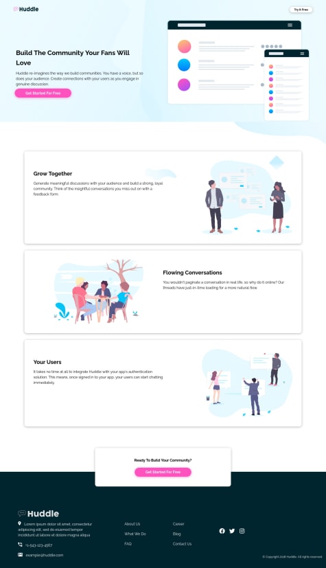
I found the nav difficult. i also had issues with the images. I tried until I made them fit, but I would like to know better techniques of sizing and arranging images for a responsive design. I hope to learn proper CSS and HTML organization and also a better way of using css grid and flexbox together.
Ikechukwu Kalu Amogu
@Aikaykalu17All comments
- @Nduka-NwagboSubmitted almost 2 years ago@Aikaykalu17Posted almost 2 years ago
My bro
For the issues you had with the pictures
You need to learn how to use the <picture></picture> tag
I really don't know how to state the whole things in words
Would have done that
0 - @R-Lemos-progSubmitted almost 2 years ago
I want to know how to best use the media queries feature.
@Aikaykalu17Posted almost 2 years agoHow good are you with the Google inspect feature???
0 - @gomes-leonardoSubmitted almost 2 years ago
Guys, I hope you're doing well! In this challenge I couldn't fulfill the background image, someone to help me? Other than that, I completed the challenge
@Aikaykalu17Posted almost 2 years ago-To get the desired background
You can use the background-position Set it to left and right then adjust until you get the desired background
0 - @EMA-WolfSubmitted almost 2 years ago@Aikaykalu17Posted almost 2 years ago
-All SVGs should be aria-hidden <img src="logo.svg" alt="" aria-hidden="true"> -Your CSS sheet should be "style.css" and not "loadingpage.css"
-The reason for margin:0 auto; is to balance the entire page to the centre of the screen -For margin:0 auto; to work, you need to give your body a max-width For instance body { max-width:1440px; margin:0 auto; min-height:100vh; } -main { display: flex; margin-top: 1rem; gap: 1.2rem; width:100 % height:100% justify-content:center; align-items:center;}
1 - @auriga2124Submitted almost 2 years ago
Hi guys,
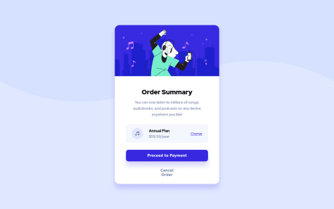
In this challenge, I tried to use BEM method. But hey, I am unsure of about pricing group code area. It is block or element? I think it is element...
This is my HTML code:
<div class="article-header__card">
    <header class="article-header">
      <figure class="article-header__image">
        <img src="./images/illustration-hero.svg" alt="hero-image">
      </figure>

      <section class="article-header__text">
        <h2 class="article-header__text-heading">Order Summary</h2>
        <p class="article-header__text-description">You can now listen to millions of songs, audiobooks, and podcasts on any
          device anywhere you like!</p>

        <div class="article-header__pricing">
          <img class="article-header__pricing-icon" src="./images/icon-music.svg" alt="icon-music">
          <div class="article-header__pricing-wrapper">
            <p class="article-header__pricing-plan">Annual Plan</p>
            <span class="article-header__pricing-tag">$59.99/year</span>
          </div>
          <a class='link-btn' href="#">Change</a>
        </div>

        <button class="btn btn-blue">Proceed to Payment</button>
        <button class="btn btn-transparent">Cancel Order</button>
      </section>
    </header>
  </div>
Thanks for advance.
@Aikaykalu17Posted almost 2 years agoFor a more semantic web page or for best practices Your div should be inside your header tag not outside it For example
<header> <div> </div> </header>•And for this project •No header tag is needed •Each page should contain only one h1 tag and each section can contain two or more h2-h3 tags •It's the reason for frontendmentor accessibility reports •SVGs are decorative images and have no meaning...all SVgs should be aria-hidden °<img src="./images/illustration-hero.svg" alt="" aria-hidden="true">
0 - @DhanalakshmiJavaDeveloperSubmitted almost 2 years ago
Hi there, This is my First solution. I found it difficult while making the page responsive. I was stuck in-between media queries. Any advice on responsive design is highly welcome! TIA :)
@Aikaykalu17Posted almost 2 years agobody{ background-color: hsl(0,0%,95%); height: 100vh; width: 100%; display: flex; justify-content: center; align-items: center; } replace the "height:100vh" with "min-height:100vh" "width:100%" with "max-width:1440px"
Then add margin:0 auto;
0 - @DhanalakshmiJavaDeveloperSubmitted almost 2 years ago
Hi there, This is my First solution. I found it difficult while making the page responsive. I was stuck in-between media queries. Any advice on responsive design is highly welcome! TIA :)
@Aikaykalu17Posted almost 2 years agoTrying to make pages responsive depends on how good you are with the Google Chrome inspect feature If you are good with the Google Chrome inspect feature then all you have to do is write the code for various screen sizes
@ media only screen and (min-width:300px) and (max-width:320px){
} Copy and paste your CSS code in between the braces Use Google Chrome inspect feature to make it responsive on 320px screens If this isn't clear I'll explain better I can put you through media queries You can as well go through my code and check out how i wrote media queries code for various screen sizes
0 - @chukwudobe-MicahSubmitted about 2 years ago
I'll appreciate if you help me review my code and website, give feedback, advices and reviews. It comes with dark mode, so please be sure to check out the dark mode, thank you.☺️😊❤️❤️
@Aikaykalu17Posted about 2 years agoHey bro I need your help on this challenge How did your make your bg top-desktop and bg-bottom to join together and be that wide??
0 - @Ade-yemSubmitted about 2 years ago


