@subhrajit77Submitted 9 months ago
Abhishek Kashyap
@Abhishek10351All comments
- @Abhishek10351Posted 9 months ago
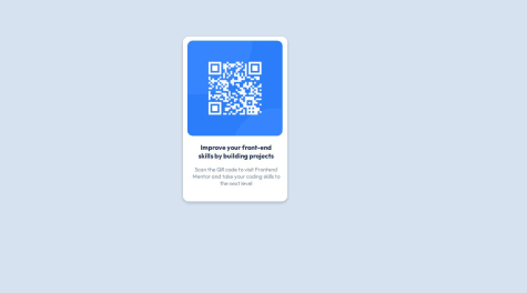
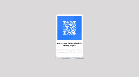
The solution is identical but you have to align the card properly. To do this you can use flexbox.
body{
display:flex;
align-items:center;
justify-content:center;
min-height:100vh;
}
Marked as helpful1 - @Devn777Submitted 9 months ago
Are there any bad practices I need to watch out for?
@Abhishek10351Posted 9 months agoYou should use semantic html like main, section , footer instead of divs and spans for everything. Do not place the contents directly inside the body, use a wrapper like main, section.
And lastly use flexbox to have better control over the elements placing. Hope it helps.
0

