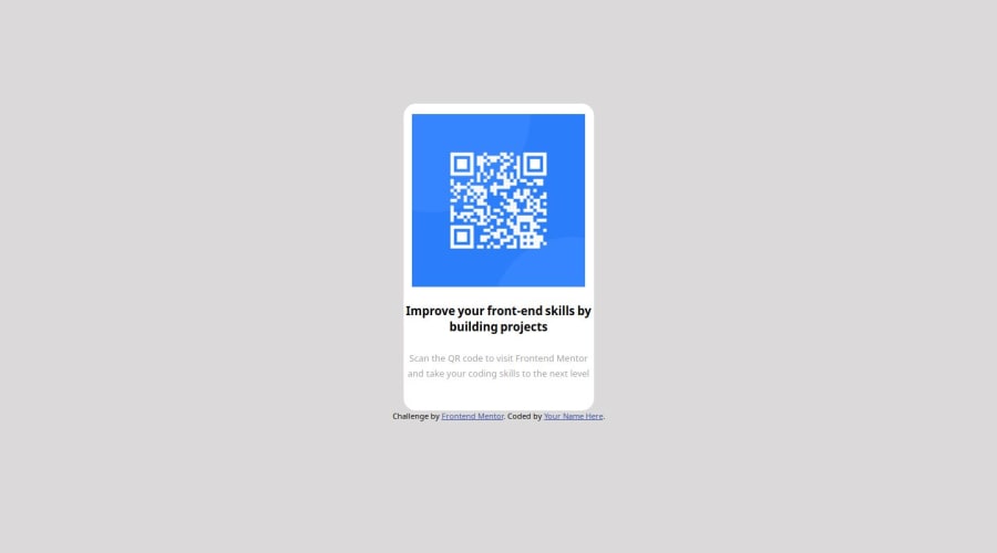
Design comparison
Solution retrospective
Are there any bad practices I need to watch out for?
Community feedback
- @emjayrukaPosted 9 months ago
Hey @Devn777. I can see that you've put a lot of effort and dedication into this. I'd like to offer some constructive feedback that may enhance the overall structure and functionality of your work. It seems the project relies heavily on generic
<div>tags rather than utilizing semantic HTML elements such as<main>,<nav>, and<footer>. Incorporating these elements can significantly improve the document's structure, making it more accessible and easier to understand.For example, everything from your
<div.card>to<span.smalltext>could be wrapped in a<main>tag, while the<div.attribute>could be replaced with a<footer>tag.You also didn't add the
border-radiusproperty to your QR image.Lastly, you should get rid of the style tag contained in the head tag since you've already created a file containing your styles
I believe these adjustments will benefit your future projects and also contribute to their overall accessibility and maintainability.
I hope I was of help.
Well done for completing this challenge. HAPPY CODING
1 - @Abhishek10351Posted 9 months ago
You should use semantic html like main, section , footer instead of divs and spans for everything. Do not place the contents directly inside the body, use a wrapper like main, section.
And lastly use flexbox to have better control over the elements placing. Hope it helps.
0
Please log in to post a comment
Log in with GitHubJoin our Discord community
Join thousands of Frontend Mentor community members taking the challenges, sharing resources, helping each other, and chatting about all things front-end!
Join our Discord
