
AbdulHaseebHussainRI
@AbdulHaseebHussainRIAll solutions
- Submitted 8 months ago
Responsive Product Preview Card Solution
- HTML
- CSS
Nested Divs Usage: I'm concerned about potentially overusing nested elements in my project. Are there more efficient and semantic alternatives I should consider?
Flexbox vs. Grid Layouts: While I used flex layouts extensively, I'm unsure if I should have utilized CSS grid instead in certain areas.
BEM Naming Convention: I've attempted to follow the BEM naming convention, but I'm open to feedback on whether my approach aligns well with best practices.
HTML and CSS Structure: I'd appreciate critiques on the overall structure of my HTML and CSS files. Are they semantically appropriate, readable, and maintainable?
Responsiveness: I've tested the responsiveness of my solution across various devices using Chrome DevTools, but additional feedback on its responsiveness would be valuable.
CSS Custom Properties: I attempted to streamline my font styling by using a single CSS custom property for fonts to reduce duplication. However, I couldn't implement it successfully. Could you suggest a feasible approach for this, and would it be recommended for improving maintainability?
- Submitted 8 months ago
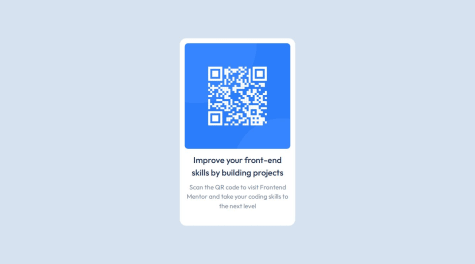
QR code component solution
- HTML
- CSS
Simplification of HTML and CSS: I'm wondering if there are further opportunities to streamline my code. Any suggestions on areas where I could reduce complexity would be greatly appreciated.
Accessibility and Semantic HTML: Are there additional HTML tags I could have utilized to enhance accessibility and improve the semantic structure of my code? Any specific recommendations in this regard would be helpful.
Font and Div Sizing: I'm unsure about the sizing of fonts and the overall div. Can you point out where I might have made errors in these aspects and offer guidance on how to correct them for better design consistency?