Not Found
Not Found
Not Found
Not Found
Not Found
Not Found
Not Found
Not Found
Not Found
Not Found
Not Found
Not Found
Not Found
Not Found
Not Found
Not Found
Not Found
Not Found
Not Found
Not Found

Submitted

QR code component solution

@AbdulHaseebHussainRI

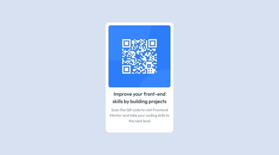
Desktop design screenshot for the QR code component coding challenge

This is a solution for...

  • HTML
  • CSS
1newbie
View challenge

Design comparison


SolutionDesign

Solution retrospective


What are you most proud of, and what would you do differently next time?

I'm pleased with the overall outcome, but I'd focus more on refining font sizes and component layouts for better consistency. Additionally, I recognize the need to enhance accessibility for improved user experience.

What challenges did you encounter, and how did you overcome them?

I initially struggled with getting started and setting appropriate font sizes. Fortunately, I sought guidance from discussions on Discord and stumbled upon a helpful blog post by Grace Snow, which provided me with the insights needed to overcome these hurdles.

What specific areas of your project would you like help with?

Simplification of HTML and CSS: I'm wondering if there are further opportunities to streamline my code. Any suggestions on areas where I could reduce complexity would be greatly appreciated.

Accessibility and Semantic HTML: Are there additional HTML tags I could have utilized to enhance accessibility and improve the semantic structure of my code? Any specific recommendations in this regard would be helpful.

Font and Div Sizing: I'm unsure about the sizing of fonts and the overall div. Can you point out where I might have made errors in these aspects and offer guidance on how to correct them for better design consistency?

Community feedback

T
Graceβ€’ 29,170

@grace-snow

Posted

Hi, The html looks great but there are some problems in the css at the moment.

  1. Never limit the height of elements that contain text, including the body. Min-height 100vh is fine to use, height is not. This is causing content to be cut off at the top on some screen sizes / for users with different text sizes.
  2. The max width on the component must be in rem not px so it scales properly even when users have a larger default text size set.
  3. Make sure the component can't hit screen edges. Either add a little padding to the body or a little margin to the component (on all sides).
  4. You can place text align center on the component itself instead of repeating it on the heading and paragraph because text alignment is inherited by children. (Optional)
  5. I recommend you place classes directly on what you want to style instead of using class element selectors. It's good to try and keep specificity low and it means if the html ever has to change in future the css would not break.

Marked as helpful

0

@AbdulHaseebHussainRI

Posted

@grace-snow Thanks for all the advice, I've been reading your blog and it has inspired some of the decisions I've made. I take on board all the above advices, they are all very much valid.

Do you also use rem units with padding, row gaps and margins or only for font sizes and min-width?

0
T
Graceβ€’ 29,170

@grace-snow

Posted

@AbdulHaseebHussainRI it depends. I use rem anywhere I would want the property to scale with the user’s default text size. (And I think you meant max-width)

0
Abdul Khaliq πŸš€β€’ 72,660

@0xabdulkhaliq

Posted

Hello there πŸ‘‹. Congratulations on successfully completing the challenge! πŸŽ‰

  • I have a suggestion regarding your code that I believe will be of great interest to you.

HEADINGS ARE NOT PROPERLY USED ⚠️:

  • This solution consists incorrect usage of <h2> so it can cause severe accessibility errors due to incorrect usage of level-two headings <h2>
  • Every site must want only one h1 element identifying and describing the main content of the page.
  • An h1 heading provides an important navigation point for users of assistive technologies, allowing them to easily find the main content of the page.
  • In this solution there's <h2> element which is this <h2>Improve your...</h2>, you can preferably use <h1> instead of <h2>. Remember <h1> provides an important navigation point for users of assistive technologies so we want to use it wisely
  • So we want to add a level-one heading to improve accessibility
  • Example: <h1>Improve your front-end skills by building projects</h1>
  • If you have any questions or need further clarification, and feel free to reach out to me.
  • If you have any questions or need further clarification, you can always check out my submission and/or feel free to reach out to me.

.

I hope you find this helpful πŸ˜„ Above all, the solution you submitted is great !

Happy coding!

0

T
Graceβ€’ 29,170

@grace-snow

Posted

@0xabdulkhalid I disagree. This is not a full web page. It is a single component challenge. This component would never act as the page title for a Web page, so h1 would be the wrong heading level. H2 is the correct heading level in this card.

0
Abdul Khaliq πŸš€β€’ 72,660

@0xabdulkhaliq

Posted

@grace-snow, But according to Web Accessibility Guidelines every page must want to have an h1 heading regardless of their size whether they are fully fledged website or small components it doesn't matter.

For example on this Article about Accessible heading structure from A11y Project also states that h1 as a must.

I can't found any researched articles to validate your statement, I'm eager to know if it's acceptable. If there's any research papers/articles available for validation its highly appreciated!

0

@AbdulHaseebHussainRI

Posted

@0xabdulkhalid Thanks for taking the time to provide feedback.

Having looked at your solution, I like your naming convention for classes, seems tidier and more meaningful e.g. .card__description, is it recommended or just a convention you follow?

0
T
Graceβ€’ 29,170

@grace-snow

Posted

@0xabdulkhalid this is not a web page. It is a component demo. When we build individual components like this card it needs to be able to be dropped into a web page.

If you want to include a h1 in this, it would be above the component eg a visually-hidden h1 that says "QR code component demo" or similar.

(ps i am a senior accessibility consultant and frontend engineer so can verify this)

Marked as helpful

0

@AbdulHaseebHussainRI

Posted

@0xabdulkhalid @grace-snow

The accessibility report does give me the following warning Page should contain a level-one heading and links to. The link refers to pages rather than components so this might be a grey area.

0
T
Graceβ€’ 29,170

@grace-snow

Posted

@AbdulHaseebHussainRI it’s not! That is a warning from axe-core about full web pages. The api cannot make a distinction between a component example and a web page. Any automated scan will generate these warnings which is why accessibility is a specialism that requires human assessment. The component would actually cause a WCAG failure when used if it had a h1 because it would break meaningful heading order in the page content. There is no grey area here.

0
Abdul Khaliq πŸš€β€’ 72,660

@0xabdulkhaliq

Posted

@grace-snow According to your suggestion all newbie challenges provided by FEM needs to have a separate sr-only headings right?

I never thought about this because this knowledge is something i want to gain in practical work experience, anyway thank you for pointing this out!

PS: I have viewed your FED MENTOR blog, it's awesome to see how much you're sharing your knowledge for new learners. It's highly appreciated please keep contributing to our community!

One thing that i would like to inform you is a minor typo on your website's mentoring page, That can be founded on "Frontend Mentor Profile" button.

0
Abdul Khaliq πŸš€β€’ 72,660

@0xabdulkhaliq

Posted

@AbdulHaseebHussainRI, The naming conventions i used on my solution is BEM. It helps us to create modular, reusable, and maintainable code. We can easily identify which styles apply to which elements, making it easier to modify and update your CSS.

BEM naming conventions provide a clear structure and naming hierarchy for your CSS classes. This makes it easier to read and understand your code, even for other developers who are not familiar with your project. So that it's recommended when we're using vanilla css on our projects.

BEM allows for more granular control over styling. We can target specific elements within a block and modify their styles without affecting other elements or blocks on the page.

BEM helps to avoid naming collisions and specificity issues. By using a consistent naming convention, you can avoid accidentally overwriting styles or causing specificity issues that make it difficult to style your elements.

BEM makes it easier to collaborate with other developers on larger projects. By using a shared naming convention and structure, you can ensure that everyone on the team is using a consistent approach to styling, which reduces confusion and errors.

This article on CSS-Tricks provides a beginner-friendly introduction to BEM and explains the key concepts and benefits of using BEM.

Marked as helpful

0
6xg0dβ€’ 190

@6xg0d

Posted

Hi! The result looks good in general, that's a great job! The font weight of the h2 should be a little bit higher in order to be more bold, but even with that, your card looks great! Talking about the areas you want help:

  1. If you want to write semantic code, keep in mind tags like section, header, footer, main, etc. For example, in your HTML, instead of using a <div> inside the <main>, you could use a <section> tag to do the same job. Also, you can put the <img> inside a <figure>

  2. Talking about simplify your code. In your CSS there are a lot of rules for tags that aren't even in your code, so your basically applying properties to non-existing elements. Less is more, so if you can get the results you want with the minimum amount of lines of code, much better. I recommend you to search for semantic html tags and accessibility practices in webs like MDN and W3schools. Hope this helps you, and keep going πŸ‘‹

0

T
Graceβ€’ 29,170

@grace-snow

Posted

@6xg0d I disagree I'm afraid. The section element is fine to use but it adds no benefit to the component semantics at all. A section is exactly like a div unless you are going to give it an aria-label or aria-labelledby. And that is unnecessary extra affordance for a small card component like this.

Additionally, the figure element should not be used to always wrap images. The only time you use the figure element is when you want/need to include a figcaption. So wrapping this image in a figure only adds unnecessary bloat to the html.

I see no extraneous css selectors in this, only a css reset which should always be included.

Marked as helpful

1

@AbdulHaseebHussainRI

Posted

@6xg0d Thanks for taking the time to provide feedback.

I have a css reset which might be what you're referring, it's a new concept for me but seems to be recommended, it's something I read up on @grace-snow blog and could alleviate unexpected issues that crop up with css at times especially for a beginner such as myself.

0

Please log in to post a comment

Log in with GitHub
Discord logo

Join our Discord community

Join thousands of Frontend Mentor community members taking the challenges, sharing resources, helping each other, and chatting about all things front-end!

Join our Discord