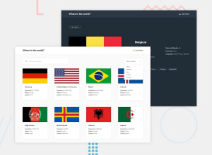
World Countries with TypeScript, React, React-Router,Recoil, Downshift
Design comparison
Solution retrospective
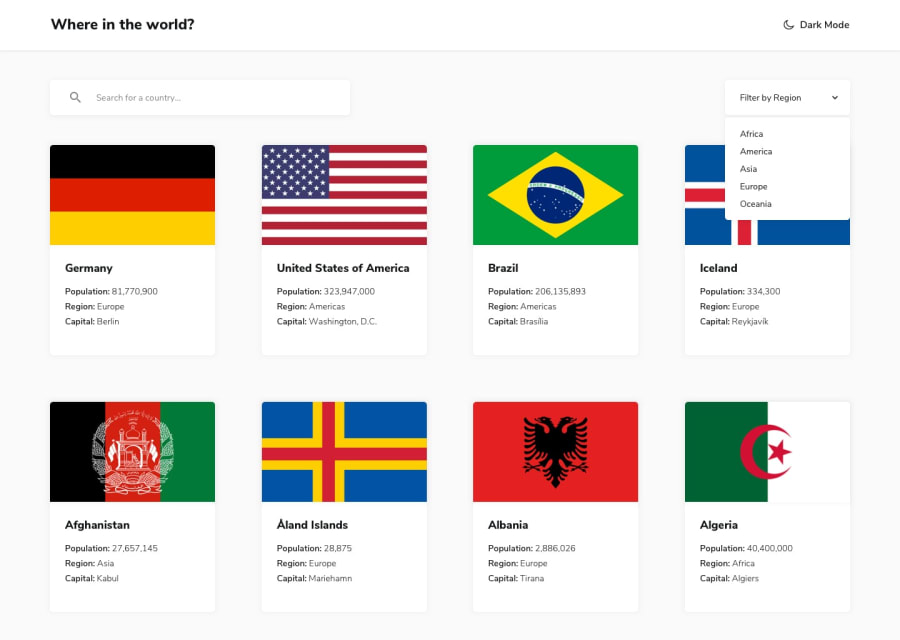
Making accessible UI components like custom select is difficult, we all know that. Fortunately there are tools like Downshift, so we don't have to re-invent the wheel. So for this challenge I build custom dropdown to match design and hooked into Downshift to make it fully accessible.
Works really great, you can test it out with keyboard or even screen reader!
As an extra:
- I implemented saving theme preference to local storage, so it stays after page reload.
- I added pagination, because 250 results seemed a little too much
Question: Is wrapping whole card in a link is good practice?
Community feedback
- @tedikoPosted over 3 years ago
Hello, Michal! 👋
You're going like crazy! Congrats on finishing another challenge. Yes, putting an anchor around a block is valid in HTML5 specs. But there is other trick you can do to achive that. Add anchor tag into your div and set it to be
position: absoluteand addwidth: 100%,height: 100%to it. Kudos for details like animations and focus states. I think that you forgot to add focus for input tho 😅Good luck with that, have fun coding! 💪
2@mbart13Posted over 3 years ago@tediko I forgot about input, right. Thanks for the tip with anchor, maybe I will use it in loopstudios challenge
0 - @mattstuddertPosted over 3 years ago
@tediko beat me to it about the anchor tag, so I'll just say well done, Michal! 😅
Your solution looks great and functions really well. I hadn't heard of Downshift before. Starring that repo for future reference!
Keep up the great work! 👍
1@mbart13Posted over 3 years ago@mattstuddert I really recommend it, it was created by Kent C. Dodds. Thanks for kind words!
0
Please log in to post a comment
Log in with GitHubJoin our Discord community
Join thousands of Frontend Mentor community members taking the challenges, sharing resources, helping each other, and chatting about all things front-end!
Join our Discord
