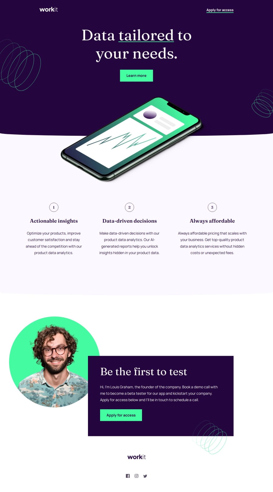
Workit Landing Page with HTML and SCSS


Design comparison

Solution retrospective
I´m not too happy with this one. I underestimated the complexity of the details like the background curve and the changes between the screen sizes.
Next time i would try to take more time planning instead of jumping right into it.
What specific areas of your project would you like help with?I didn´t found a solution for the background curves. I could have made an image myself and use it, but i guess the idea is to use what we have in the starting data.
Next problem was the spacing between the sections, i couldn´t use margins because of the different background colors and switched to paddings instead. This works, but im not sure if this is a "clean" solution.
Community feedback
- P@lynx232Posted 3 months ago
Does the solution include semantic HTML?
- Yup. Nice use of proper tags instead of just defining everything as a div;
Is it accessible, and what improvements could be made?
- I would suggest adding a footer where you credit yourself as well as frondendmentor;
- I think it is better to use font @font-face instead of @import when fonts are provided in the zip file. That is because you when using @font-face you no longer have to adhere to a particular set of "web safe" fonts that the user has pre-installed on their computer;
- Use a predefined modern reset, it makes your job easier. I prefer A Modern CSS Reset - Josh W Comeau;
Does the layout look good on a range of screen sizes? -It does. Great job!
Is the code well-structured, readable, and reusable? -It is!
Does the solution differ considerably from the design? No, except for the background curves.(truth be told this is the part that I also found most difficult in the whole challenge).
So, the solution I found is as follows: You need to separate the background into 2 different elements(actually 3, but the 3rd is nested in the 2nd); what i did was:
- nest all the elements found in the part of the page with a dark purple background into a header element, and everything else I nested in a main element. Now, within the main element i further nested everything found in the light purple part of the page into a section element;
- next, I used the clip-path: ellipse(200% 100% at 50% 0); property for both header and section elements(this looks best for mobile view, for other screen sizes you will have to modify the first value);
- now, you probably have noticed that using this property while the phone img element is nested in the header will cause it to clip, I solved this problem by doing the following:
- The img element is taken out of header and nested only in body;
- header and section will be set as position: relative, while img will be set as position: absolute;
- header and section will be set as z-index: 1 while img will be set as z-index: 2(bigger value so it will overlap them);
- Lastly, use different positioning properties in order the arrange these elements as needed.
I want to end this by telling you that you did a great job on your project, and I wish you good luck further down this path. Lastly, I would like to ask to review as many solutions on this website as possible, so that we could all continue to improve, and that you will ask the same of others.
Once again, best of luck on your journey! 🍻
0

Please log in to post a comment
Log in with GitHub
Join our Discord community
Join thousands of Frontend Mentor community members taking the challenges, sharing resources, helping each other, and chatting about all things front-end!
Join our Discord