Web Ninja 101 | Project Tracking intro

Solution retrospective
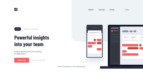
Pheouw, first junior challenge done. That was tough. Just want to know if there is another way to deal with the menu hamburger and the position of the illustration.
Please log in to post a comment
Log in with GitHubCommunity feedback
- @Devcrowmaster
Hi, good job, you need to add overflow-y: scroll in desktop view and get a little better in tablet view.
- @mattstuddert
Nice work on this challenge! @Devcrowmaster has already made a couple of good points. You've done a good job though! The way you've handled the image and hamburger are fine.
My main recommendation would be to go through the CSS one more time matching your solution up to the design to try and get your project as close to the design as possible. Accuracy is a key part of being a front-end developer, so it's a skill that's well worth taking some time to build.
Keep up the great work!
Join our Discord community
Join thousands of Frontend Mentor community members taking the challenges, sharing resources, helping each other, and chatting about all things front-end!
Join our Discord