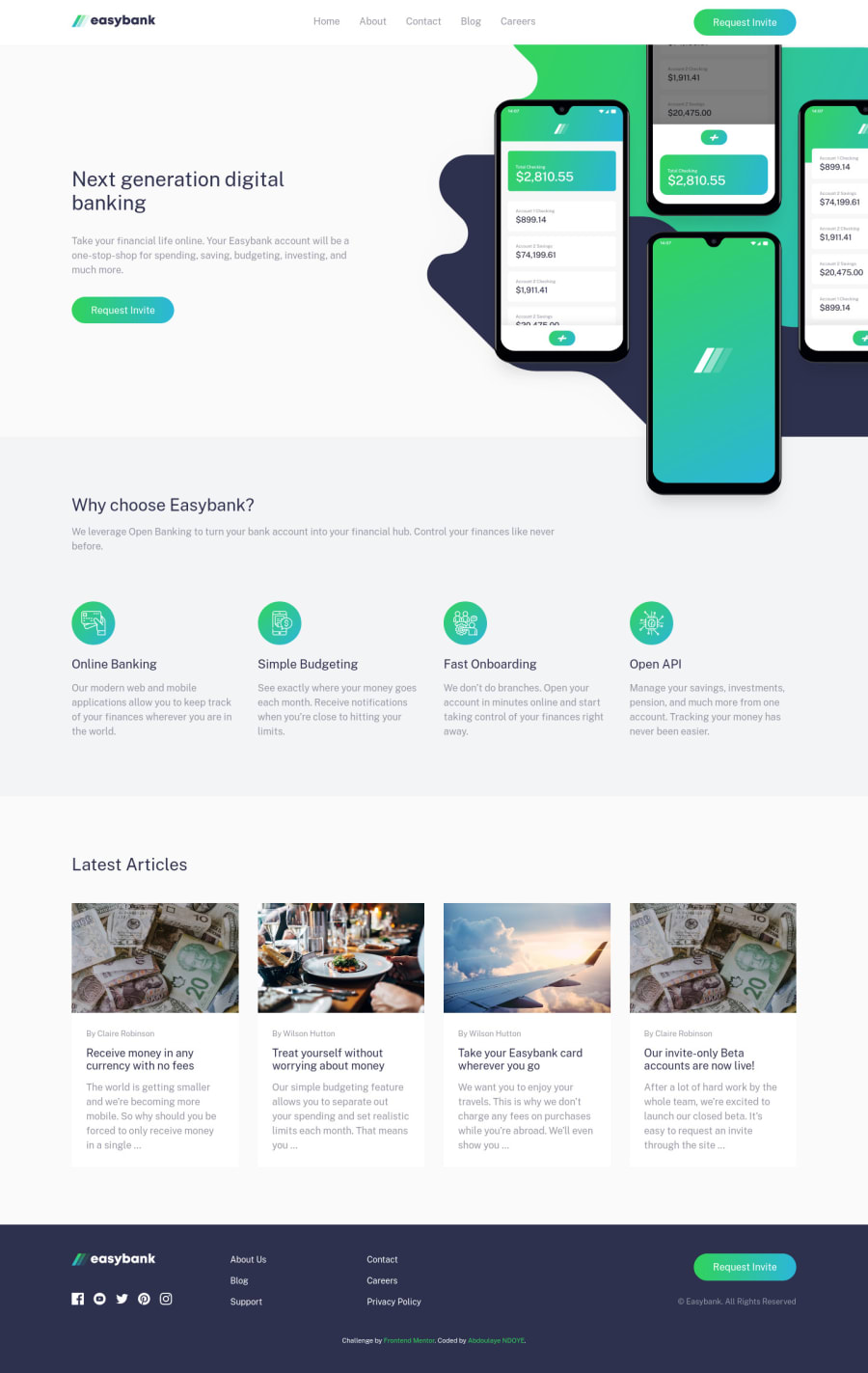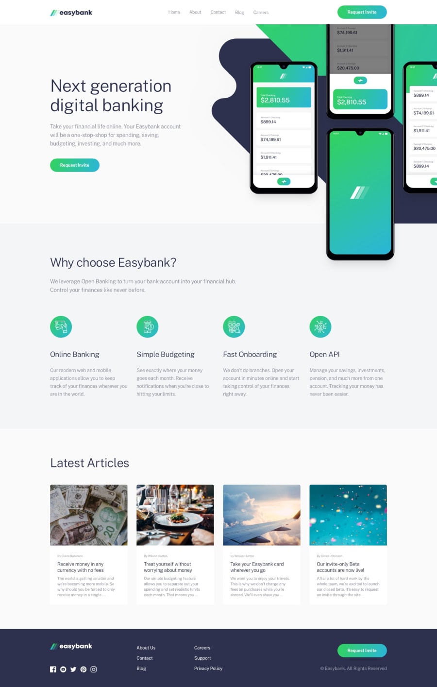
Web Ninja 101 | Easybank homepage built with HTML, CSS & JS
Design comparison
Solution retrospective
This one was a little challenging. Positioning the hero image on mobile and on desktop was the trickiest part for me. I had to resort to a lot of z-index, some weird operations to define the width of the image ... I'm open to any feedback on improving the positioning of that element. Thanks!
Community feedback
- @artimysPosted over 4 years ago
Great job on this solution Abdoulaye NDOYE!! 👍👍 I haven't reached this challenge yet to offer actual advice but it responds really well. I like the way the hero image flows.
The only thing I see is to add some hover styles to the mobile menu links.
Keep on coding!!
0@NDOY3M4NPosted over 4 years ago@artimys thanks for the feedback, I'll try to add the hover styles for mobile.
0
Please log in to post a comment
Log in with GitHubJoin our Discord community
Join thousands of Frontend Mentor community members taking the challenges, sharing resources, helping each other, and chatting about all things front-end!
Join our Discord
