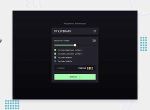
Design comparison
Solution retrospective
I feel like I was able to work through the JS logic pretty easily to get this app to function properly.
What challenges did you encounter, and how did you overcome them?The biggest challenge was to get the checkbox styled to the design specs. But that in my opinion was a fairly small challenge.
What specific areas of your project would you like help with?I would appreciate any tips/suggestions on how to improve my code. Thanks!
Community feedback
- P@juliengDevPosted 7 months ago
Hello again @nvalline :)
Here are the points I liked compared to my own approach:
•	Use of crypto.getRandomValues: This is a good practice to enhance the security of the password generation process.
•	Validation of options: The logic for validating options using FormData is interesting to ensure that at least one option is selected before generating the password. This could be useful if I want to implement more rigorous validation in my own code.
•	Visual feedback on the slider: The visual feedback on the slider’s progression is a nice enhancement for the user interface and could be a good addition to my project.
The design is faithful to the original mockup, and I'm always impressed by how you're able to achieve an almost pixel-perfect integration.
I noticed an issue in the application where, if you adjust the slider to set a maximum number of characters but don’t check any options, the output displays undefinedundefinedundefinedundefined. Perhaps you could add a validation step in the logic to handle this case.
Congratulations on the code and the project! Keep up the great work!
Marked as helpful0
Please log in to post a comment
Log in with GitHubJoin our Discord community
Join thousands of Frontend Mentor community members taking the challenges, sharing resources, helping each other, and chatting about all things front-end!
Join our Discord
