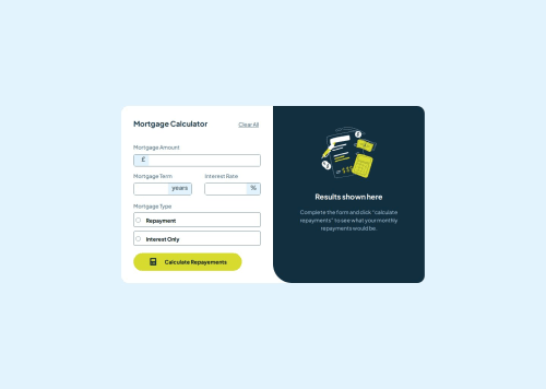
vanilla javascript, mortgage calculator
Design comparison
Solution retrospective
I'm proud that I at least finished the project, even though the code source requires some refinement
What challenges did you encounter, and how did you overcome them?When trying to put that fixed text inside the input, I faced the real first hurdle in the project, after that comes all the validation steps in javascript. With a lot of research, I finally, somehow made it works
What specific areas of your project would you like help with?I'm requesting feedback from all of you fellow learners on how to better structure my code, whether it's css or javascript
Community feedback
- @grace-snowPosted about 1 month ago
I'm going to focus on the html in feedback as that is what is poorly affecting accessibility in this challenge. I hope this is helpful.
- all of the sections in this ate doing nothing at all. They act just like divs unless labelled and you wouldn't want any of them to be labelled (ie to act as real sections) where you have them at the moment. Divs would be perfectly adequate, as layout purposes is the only reason they're needed from what I can see. Sometimes using sections just helps us developers read the code easier, but in this case the section placements actually makes this code harder to read.
- if using text type for inputs that will expect numbers, use the pattern and inputmode attributes so the correct keys are allowed and most appropriate keyboard shown on mobiles.
- it would be much better if the errors were wrapped in an element with an
aria-live
attribute and uniqueid
, so that inputs could bearia-desciribedby
thatid
. Doing that would ensure that errors are announced by screen readers and that they are programmatically linked to the inputs. The other alternative that isn't quite as good would be giving the existing error elements arole="alert"
as that would at least make sure they get announced, but wouldn't link them to any specific field (meaning it's harder for people to find where the error occurred). - the mortgage type field has incorrect structure and group labelling. This shouldn't have a heading. It needs to be a fieldset with legend. This is essential.
- the calculator icon is decorative so must have empty alt.
- I'd expect results to be inside an aria-live region.
- the results numbers must not be a heading element, that just doesn't make sense as a heading. A description list would make sense or headings with paragraphs for the numbers.
Marked as helpful0@Joliot-TSIMISARAKAPosted about 1 month ago@grace-snow Thank you very much for the feedback, I've done quite a bit of research on accessible form validations and it's as you cited, there's a lot to consider Seems like there's some work left to do in my code
0
Please log in to post a comment
Log in with GitHubJoin our Discord community
Join thousands of Frontend Mentor community members taking the challenges, sharing resources, helping each other, and chatting about all things front-end!
Join our Discord