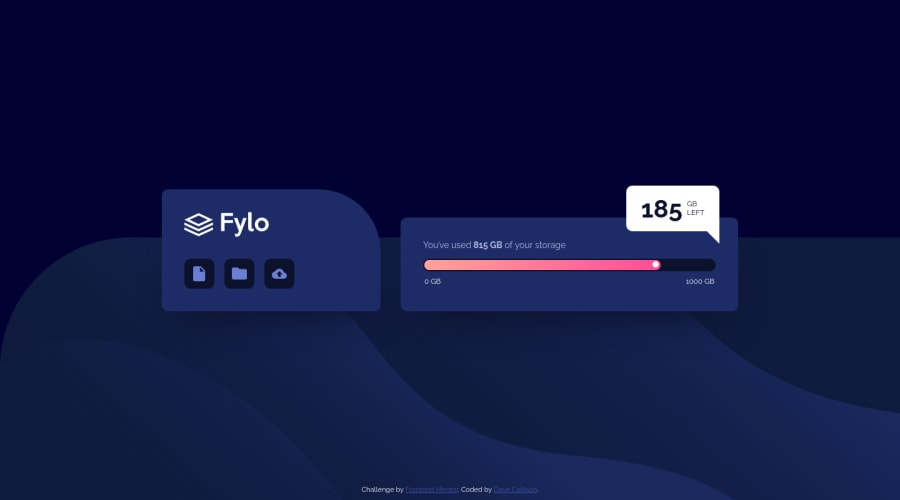
Submitted almost 4 years ago
vanilla CSS and HTML with flexbox and grid. Plus pseudo elements.
@thebigdavec
Design comparison
SolutionDesign
Solution retrospective
Any feedback always welcomed.
Community feedback
- @lukebergmannPosted almost 4 years ago
This is great! I can't decide if I like yours or the original better!
0 - @emestabilloPosted almost 4 years ago
Hi Dave, project looks really good! Excellent control of the design. Just a few thoughts:
- I'd add
cursor: pointerto the icons for UI. In a real app, they'd likely be used to upload something. - Small thing: if the viewport is shorter than the content, like in mobile landscape, the attribution link overlaps the
statsdiv. (I know it well..I have the same problem on my project lol)
Hope this helps!
0@thebigdavecPosted almost 4 years ago@emestabillo Thanks. I'm definitely not going to sweat too much about the attribution. It's positioned absolute and that's fine for the purpose of these challenges. Agree with the cursor:pointer. Maybe I'll add a hover state too. Cheers!
0 - I'd add
Please log in to post a comment
Log in with GitHubJoin our Discord community
Join thousands of Frontend Mentor community members taking the challenges, sharing resources, helping each other, and chatting about all things front-end!
Join our Discord
