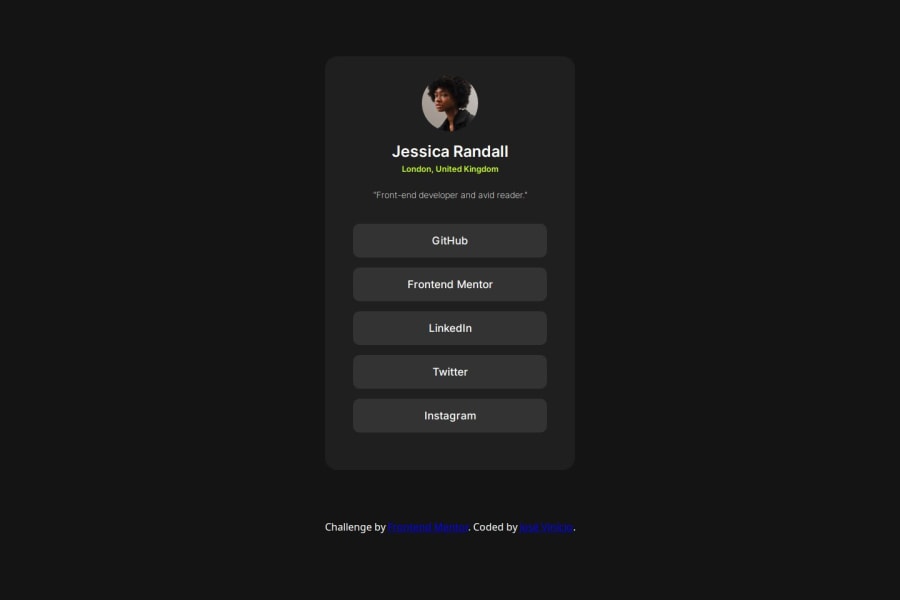
utilizei a "@media (max-width: 425px)" para aplicar a responsividade
Design comparison
Solution retrospective
Fiz so no olho, sem usar medidas pré definidas.
What challenges did you encounter, and how did you overcome them?nenhum
What specific areas of your project would you like help with?nenhuma
Community feedback
- @Alexandru736Posted 12 months ago
Regarding the design, there are some aspects you might have missed. For example, you need to apply the right weight to the text font, or apply the right color to the description text. I see you used margins to layout the container and the attribution component. I find this not a very good practice in the future if you want to develop more complex styles. You could use instead(apart from
marginshorthand),display: flex. Flexbox is actually pretty versatile and you could use it in many situation, not only when you have lists. Therefore you could flexbox, and then center the container in the middle of the screen, then set agapbetween the container and the attribution, or useabsolutepositioning to place it at the bottom of the screen. It is also a good practice to place the attribution component in afooterlandmark instead of using just adiv.0
Please log in to post a comment
Log in with GitHubJoin our Discord community
Join thousands of Frontend Mentor community members taking the challenges, sharing resources, helping each other, and chatting about all things front-end!
Join our Discord
