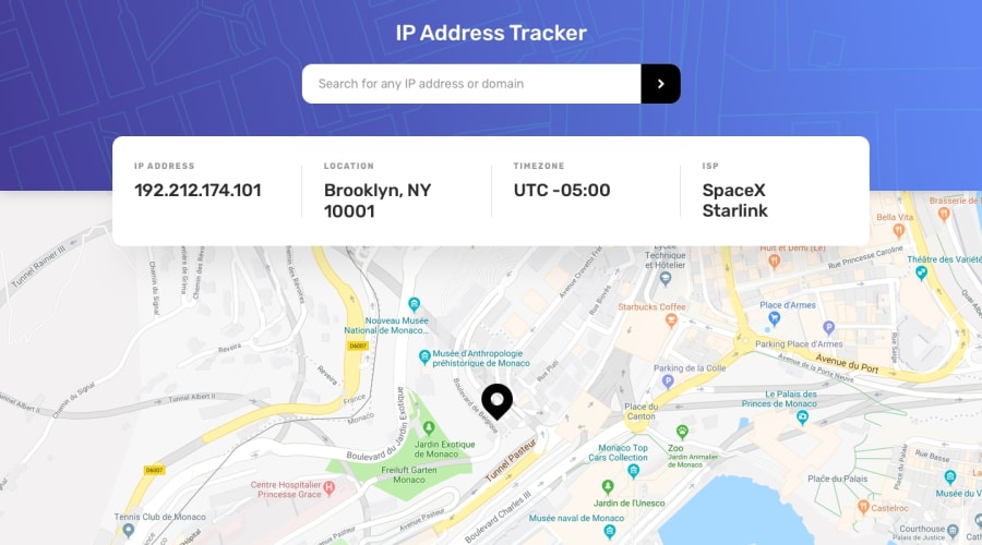
Design comparison
Solution retrospective
I would like you to give my code a feeback please
Community feedback
- @RayaneBengaouiPosted over 3 years ago
Hello edson,
Congrats for completing this challenge ! 🙂
I would like to suggest :
-
Add a loader or something that tells the user when it's loading. It's better for user experience to know something is coming rather with a visual rather than having a blank. You did it well when the input is incorrect with that red outline !
-
Modify the
font-familyof your h1 to match the design. -
You can add more padding to your boxes to create more space.
-
On mobile view, move the Zoom in/out buttons to the bottom because it's hidden between the info container. If you are blocked, I've made it on my solution to this challenge.
Overall, well done for the challenge and happy coding ! 😃
0 -
Please log in to post a comment
Log in with GitHubJoin our Discord community
Join thousands of Frontend Mentor community members taking the challenges, sharing resources, helping each other, and chatting about all things front-end!
Join our Discord
