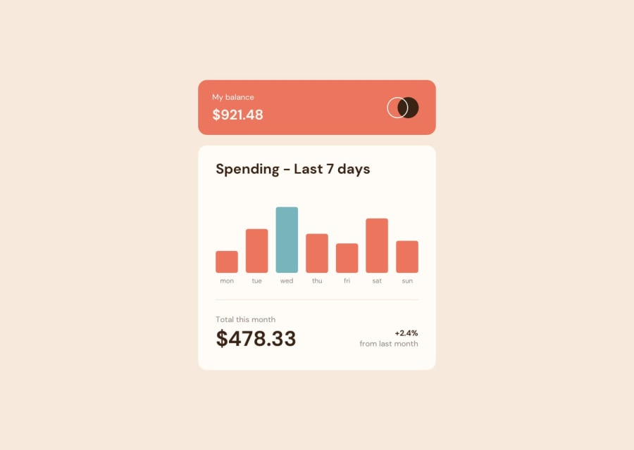
Design comparison
Solution retrospective
My first junior JS challenge and the first time with fetch. Any feebacks are welcome.
Community feedback
- @caarlosdamianPosted over 1 year ago
Congratulations on completing the challenge! 🎉 I have some recommendations for your code that I think you will find useful.
Let's talk about HTML 🏷. Your solution currently generates accessibility error reports, and one of the issues is that
Buttons must have discernible textTypically appears when a button element in HTML does not have text or has text that is not meaningful or understandable to users.Buttons are an important interactive element on web pages, and they should be designed in a way that allows users to understand their purpose and function without relying solely on visual cues. Providing meaningful and descriptive text on buttons is one way to achieve this goal.
More info Buttons
I hope you find this helpful 😊 Your solution is great, and I wish you all the best in your coding journey!
0
Please log in to post a comment
Log in with GitHubJoin our Discord community
Join thousands of Frontend Mentor community members taking the challenges, sharing resources, helping each other, and chatting about all things front-end!
Join our Discord
