

Design comparison

Community feedback
- @skyv26Posted 2 months ago
Hi @Student-Adil,
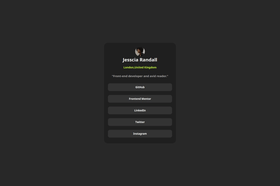
✨ Great job on your project! The card's responsiveness is impressive as it adapts well to different screen sizes. However, there’s still room to refine it further to match the actual design more closely. Keep up the good work—it’s heading in the right direction! 🚀
Suggestions for improvement:
1️⃣ Enhance button semantics:
Instead of using<button>, wrap the social media links in an unordered list (<ul>) with list items (<li>) and replace buttons with<a>tags. This change will make your project feel more like a real-world application, where users might want to navigate to actual social media profiles. Example:<ul> <li><a href="https://github.com">GitHub</a></li> <li><a href="https://frontendmentor.io">Frontend Mentor</a></li> <li><a href="https://linkedin.com">LinkedIn</a></li> <li><a href="https://twitter.com">Twitter</a></li> <li><a href="https://instagram.com">Instagram</a></li> </ul>2️⃣ Improve code structure:
Your HTML and CSS can benefit from better formatting for readability and maintainability. If you're using VS Code, try installing the Prettier extension to auto-format your code. If you’re using another editor, look for a similar tool to ensure a clean and consistent structure. 🛠️These small tweaks will elevate your project and make it feel even more polished and professional. Great effort so far—keep going! 💪✨
0

Please log in to post a comment
Log in with GitHubJoin our Discord community
Join thousands of Frontend Mentor community members taking the challenges, sharing resources, helping each other, and chatting about all things front-end!
Join our Discord