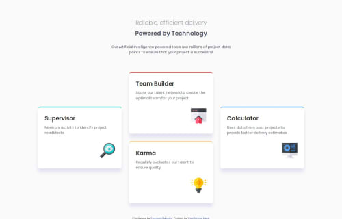
Design comparison
Community feedback
- @Abdulgafar-RiroPosted 9 days ago
Feedback on Your Four Card Feature Section Solution
Your solution is well-structured, clean, and effectively implements CSS Grid for layout. Below is an evaluation based on semantic HTML, accessibility, responsiveness, and code quality.
Strengths:
- Good Use of Semantic HTML
Proper use of <header>, <main>, <h1>, <h2>, and <p> improves readability and SEO.
Suggestion: Instead of using <div class="card">, consider using <article class="card"> for better semantic meaning.
- Grid-Based Layout for Better Control
grid-template-areas helps maintain a structured, responsive design for different screen sizes.
The display: grid layout ensures cards are positioned correctly.
- Typography Consistency
The Poppins font is well-integrated.
Class-based font weights (poppins-extralight, poppins-semibold) improve readability and maintain a consistent text hierarchy.
- Accessible and Descriptive Alt Text
Image placeholders (::after content) are used correctly to maintain visual hierarchy without cluttering HTML.
Improvement: Add a screen-reader-friendly alternative by using ARIA labels or visually hidden text. Areas for Improvement:
- Accessibility Enhancements
Solution: Add aria-labels for better screen reader compatibility.
<h2 class="poppins-semibold" aria-label="Supervisor - Monitors activity to identify project roadblocks">Supervisor</h2>Also, for <h1>, wrap each span in a <span role="text"> to improve screen reader navigation.
- Missing Mobile Alignment Adjustments
The mobile layout is centered, but cards could be better spaced. Solution: Adjust the gap and margin in media queries.
@media (max-width: 768px) { main { gap: 1.5rem; margin-block-end: 2rem; } }
- Improve Readability of Inline Styles in SCSS
The grid-template-areas section is correct but could be formatted better. Solution: Organize it into a more readable structure:
main { display: grid; gap: 2rem; grid-template-areas: ". team ." "super team calc" "super karma calc" ". karma ."; grid-template-columns: 1fr 1fr 1fr; }
This makes it easier to debug and maintain.
Final Thoughts
Your solution is visually appealing and well-structured. With minor accessibility improvements, better spacing for mobile, and SCSS readability enhancements, this would be a perfect submission.
Great job, keep up the great work!
1
Please log in to post a comment
Log in with GitHubJoin our Discord community
Join thousands of Frontend Mentor community members taking the challenges, sharing resources, helping each other, and chatting about all things front-end!
Join our Discord