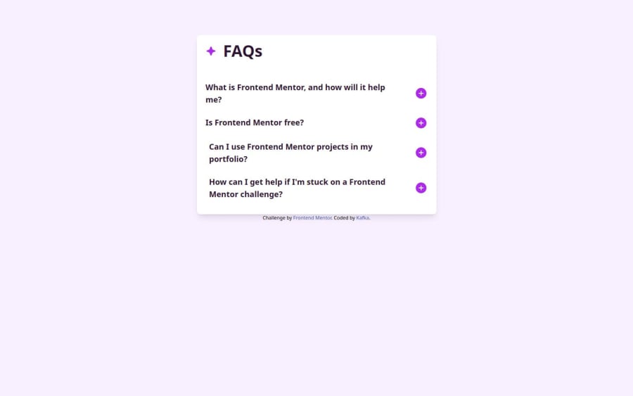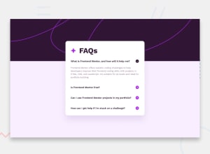
Design comparison
SolutionDesign
Solution retrospective
What are you most proud of, and what would you do differently next time?
Apply a different technique to swap the image of the Icon-Plus and Icon-Minus
What challenges did you encounter, and how did you overcome them?Using Ailwind with JS and using the background of a page in a different way
What specific areas of your project would you like help with?Using events in javascript,flax in css
Community feedback
- @ShivangamSoniPosted 10 days ago
Nice Work
A few Suggestions:
- Background Image: As shown in the design, there's supposed to be a background image on top of the page
- Accessibility: Try making the page a bit more accessible, as right now the open close functionality is purely visual. I suggest looking into ARIA Attributes.
- Animations: The accordion is opening & closing fine but a subtle opening & closing transition would make it look better
Marked as helpful0
Please log in to post a comment
Log in with GitHubJoin our Discord community
Join thousands of Frontend Mentor community members taking the challenges, sharing resources, helping each other, and chatting about all things front-end!
Join our Discord
