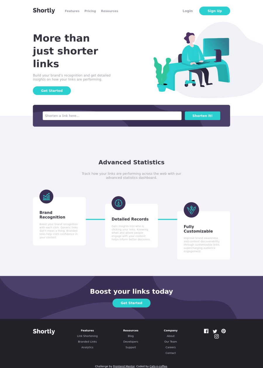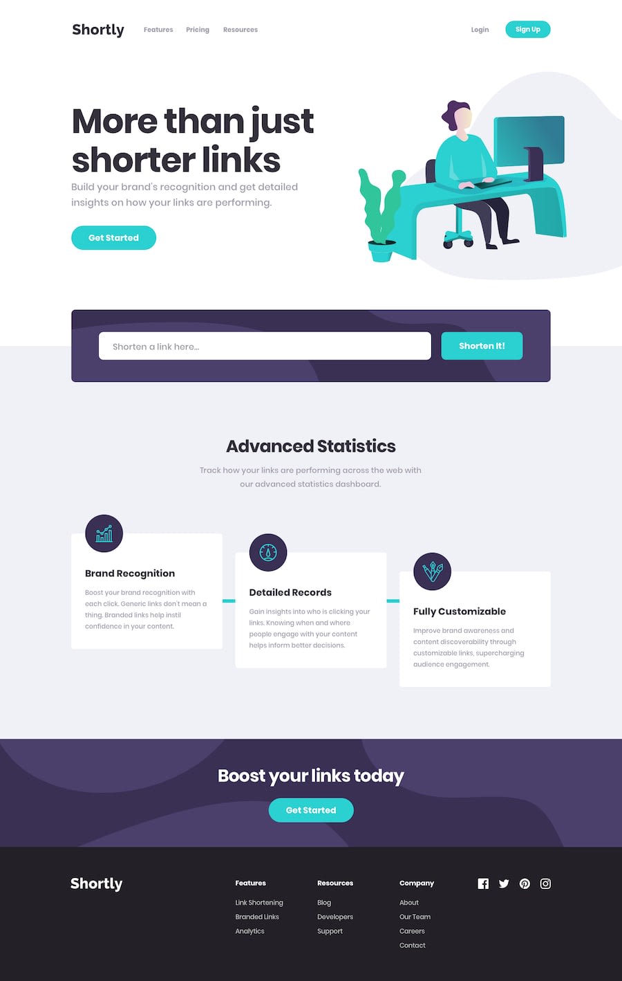
Design comparison
Solution retrospective
Hi everyone! I did this challenge using plain HTML, JS and organized the styles with SCSS. I did a little bit of research/learning on how to scale SVGs and use them the proper way so they behave as expected, let me know if I should've done things differently. I believe accessibility could be a lot better, let me know what I should change first. The dynamic result list is inside a ul tag, so all rows are li tags with span tags inside (does it make sense?). Any feedback on anything is greatly appreciated, thank you!
Community feedback
- @iamjmitchPosted about 4 years ago
Nice looking website. Only thing I would suggest is to add the max-width of 1440px from the style guide as when viewing the site on a 2k monitor, everything is really spread out and far apart
0@Cats-n-coffeePosted about 4 years ago@iamjmitch Thank you for you feedback! I was actually about the research how to limit the view to spread on wide screen as I just saw how ridiculously wide it can get on these screens. I'm going to add that media query, thank you very much!
0@iamjmitchPosted about 4 years ago@Cats-n-coffee no worries at all! let me know if you get stuck, more than happy to help
0@Cats-n-coffeePosted about 4 years ago@iamjmitch I added a media query that seems to work but I am working on a 13 inch laptop so I can see it only from the devtools. The image seems to expand a little over the rest I will need to find a solution for that. Thank you for helping!
Edit: I thought I had set the overflow: hidden on the container, but I didn't. So I added that and the image is getting stopped with the rest of the page (I find it better without the image being cut, how should it be?)
0@iamjmitchPosted about 4 years ago@Cats-n-coffee The media query worked a little too well. There's now sadly white bars at the side which i'm assuming that's not what you're after. You still want the body and layout to be 100% of the screen, its just the actual content you want to be contained within 1440px .
What you're after can be done without media queries to be honest. Remove the media query you added and try this:
#section-1
max-width: 1440px;
margin: 0 auto;
#section-2
max-width: 1440px;#section-3 .presentation-cards
max-width: 1440px;the above should have also addressed the issue of the image chopping, Let me know if this is closer to the desired look
0@Cats-n-coffeePosted about 4 years ago@iamjmitch Thank you for your help, it is hard to picture what's the best way to make this look good on wide screens. I think I see what you mean, so to summarize you want the background to take the whole screen (so you still have some color and no strange cut), images to still have their nice shape, and the content to be contained? I added the code you gave me, and I also added it to the header because it was offset to the left. Now the header and section1 are smaller than the rest because the padding and the box-sizing. Should i add a media-query for wide screens and change the box-sizing to content-box? (I tried and it seemed okay). Wide screens are more complicated than mobile :)
0@iamjmitchPosted about 4 years ago@Cats-n-coffee Sorry for the delayed response
You can play around with and see what you like best. I had a look at the preview site after your changes and it looks really nice on a large screen now :)
Sadly the only real easy way to check what a big screen looks like from a small screen is DevTools so you are 100% correct there in the way you are testing. If changing section-1 to content-box looks how you want it than that's perfect.
0@Cats-n-coffeePosted about 4 years ago@iamjmitch Thank you for all that important feedback. One last question: do you ever add any extra html markup for styling purposes for wide screens?
0@iamjmitchPosted about 4 years ago@Cats-n-coffee
Do you mean for example extra graphics? If so, I've never personally done it but there's no reason why you couldn't. As long as the important information is available across all devices regardless of screen size, the layout is all upto you how you want it to be
0@Cats-n-coffeePosted about 4 years ago@iamjmitch Yes extra layout or other graphics. I was thinking if some users have extra space, then maybe some projects would want to use that space horizontally, instead of having them scrolling down? Or is that never addressed while developing any frontend?
0@iamjmitchPosted about 4 years ago@Cats-n-coffee
Thats a little bit hard to explain. 100% theres nothing stopping you from making wide screen websites. It more comes down to best output for minimum input. You want your website to look good on as many different devices without too much coding difference between them.
Over 50% of all internet users visit websites from their mobile phone, hence why mobile-first design is such a big topic. About 46-47% of the remaining users are viewing from desktop and of that, there is only a very small percentage of users who are viewing from screen resolutions higher than 1920x1080 so you target that resolution and work down. If you ran a website and the statistics show that you have a large number of users viewing from larger screen sizes, than absolutely make a design with this in mind. Same goes for if, for example, 90% of your users view your site on mobile, you would put focus on making sure the mobile side of things are spot on. But in general you want to target designs around your main audience's screen size but at the same time make a few minor tweaks to ensure its still pleasant to view on larger screens for those who have them.
As technology progresses and larger screen sizes become the normality, wider designs will become more common.
Have a look at the below website if you'd like. They go into detail about what the most used resolutions are. Quite a nice read if you're interested. https://www.designrush.com/trends/website-dimensions
0@Cats-n-coffeePosted about 4 years ago@iamjmitch Interesting read indeed, I bookmarked it! Thank you so much for answering all these questions and helping with my solution!
1
Please log in to post a comment
Log in with GitHubJoin our Discord community
Join thousands of Frontend Mentor community members taking the challenges, sharing resources, helping each other, and chatting about all things front-end!
Join our Discord
