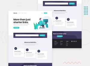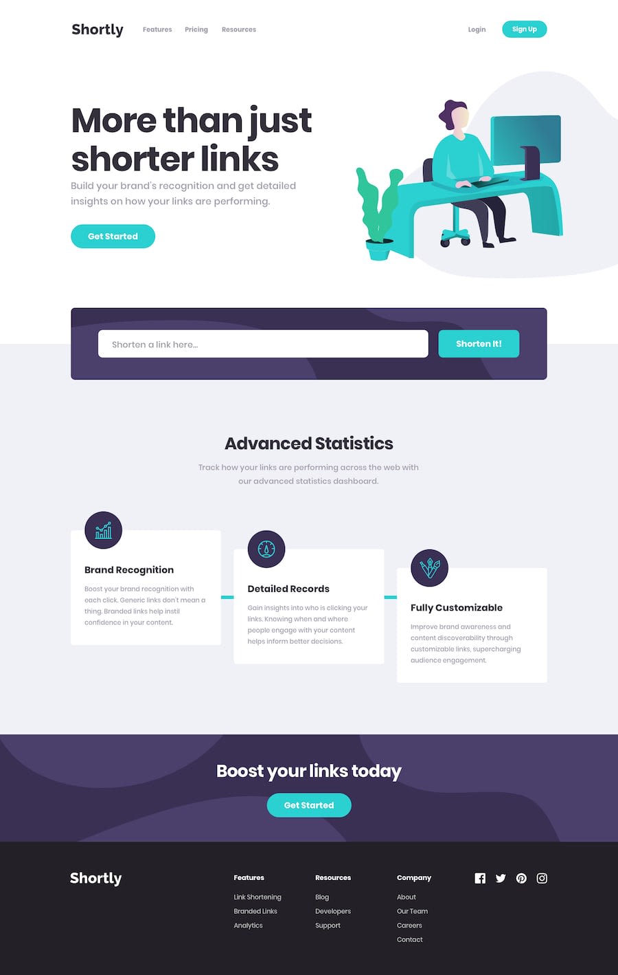
Design comparison
Solution retrospective
This was quite a daunting challenge...Learnt a lot from this challenge.
Kindly review, feedbacks are very welcome!
Community feedback
- @anoshaahmedPosted almost 3 years ago
To avoid accessibility issues in the future wrap everything in your body in
<main>OR giverole=""to the direct children of your<body>... Click here to read moreGood job! :)
Marked as helpful1 - @idesmarPosted almost 3 years ago
Some additional container tags to suppliment @Aakash suggestions are
<header>,<section>(section will require a heading tag inside: h1-h6) and<footer>.Happy coding!
Marked as helpful1 - @skyv26Posted almost 3 years ago
Hi! Michael,
To solve accessibility issues:
-
wrap everything in your body in <main> OR give role="" to the direct children of your <body> ... Click here to read more here
-
Always use
aria-labelfor block elements.
Good Luck ;)
Marked as helpful1 -
Please log in to post a comment
Log in with GitHubJoin our Discord community
Join thousands of Frontend Mentor community members taking the challenges, sharing resources, helping each other, and chatting about all things front-end!
Join our Discord
