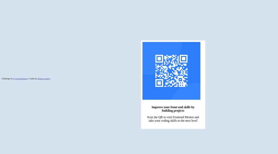
Design comparison
Solution retrospective
I made some changes, many thanks for the contributions. More contributions are appreciated. thank you....
Community feedback
- @chinh1402Posted about 1 year ago
Okay, a lot of things I think I gotta point out here.
- The image is inside the div with the class "container", but it is expanded out of "container" because the image itself is too big. Instead of giving inline-style of width: 300px, I suggest giving it width: 100%; That way, the image will fill up the width of the content part of the container, and won't actually make its way out of the container div
- The challenge's design has some nice rounded corners, you want that to be on your design as well. You should do some research on "border-radius" property, it would make your design much more satisfying
- I suggest you use the font from the style-guide of the challenge; The way I usually use the font is to use links embed from google font, you should do some research on that too
- The way you centered the card is not ideal.. There are a lot of ways for you to center anything. I'll provide you with a way that I usually do, you can check my codepen
If anything you want to ask, you can reply directly under this comment, and I'll try to answer them to the best of my knowledges
Everyone has a starting point. Hopefully, I can see more of your solution in the future.
Happy coding 🤞
Marked as helpful0@Bimme2audreyPosted about 1 year ago@chinh1402 Many thanks. I'll do well to go research.😊
0@Bimme2audreyPosted about 1 year ago@chinh1402 please what is meant by landmarks?? I could see warnings indicating "All page contents should be contained by landmarks".
I don't seem to get it. Thank you
0
Please log in to post a comment
Log in with GitHubJoin our Discord community
Join thousands of Frontend Mentor community members taking the challenges, sharing resources, helping each other, and chatting about all things front-end!
Join our Discord
