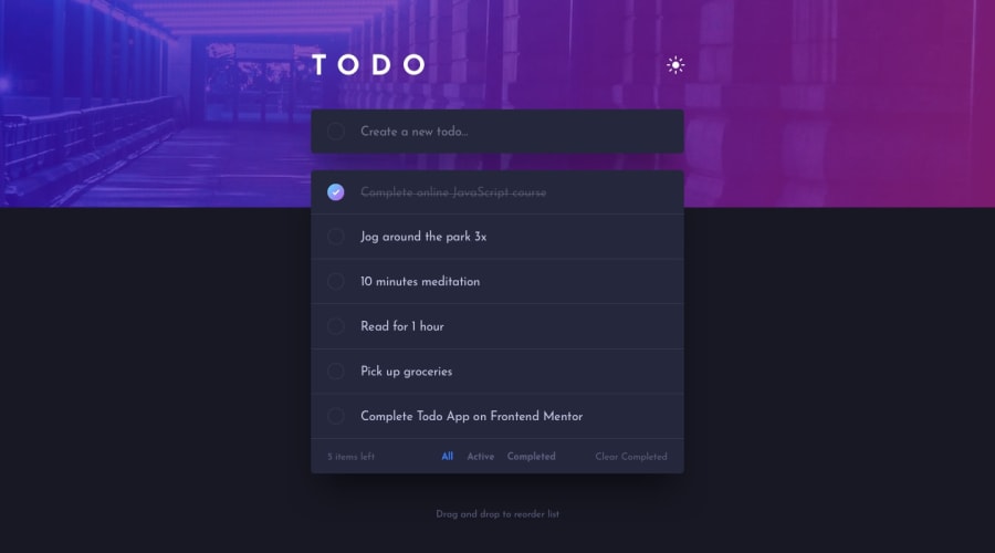
Design comparison
Solution retrospective
This one was easier than I thought, there were no really challenging part.
The only part that a little bit tricky was to reorder todo list with drag events where I referenced to MDN drag event.
Some features I added:
- localStorage
- self entertaining stuff ( bgm, bgm button, dancing pic etc. )
I'm open to any kinds of feedbacks and each feedback is very much appreciated.
Community feedback
- P@tedikoPosted over 3 years ago
Hello, Jay! 👋
Nice and clean solution, good to see you finish another challenge! I have a few suggestions:
- When i change a tab between all, active or completed the color stays always on "All" tab, i think you forgot to add active class to selected tab.
- I think it would be better to make whole todo to be able to mark as checked not just this small circle.
- Since you use LocalStorage for todos, you can also add todos after reorder to LocalStorage so the user after entering the website, he will have the same order.
- I can't reorder items on mobile.
Good luck with that, have fun coding! 💪
2@JunjiequanPosted over 3 years agoHello tediko,
Thank you for the feedback.
your suggestions are really pushing me to another level :DDD
I definetly need to put some efforts to do the local storage reorder part and make reorder supportive on mobile.
I thought my solution was farily good enough untill I saw your solution on this one. man, I don't know what to say. No excuses, im gonna push myself further.
you have fun coding too :)
0 - @grace-snowPosted over 3 years ago
Hi
Why are you giving divs a role of button? Why not use button elements? Like this you would need to add loads of js to make it accessible.
Still on accessibility, look into how to build an accessible theme switcher toggle. Nice effects on this, but it would be unusable for me on my computer.
Remember to turn off all animation and motion for those who prefer reduced motion too...
When I tap the theme switcher the first time, the whole top section goes white (ill add a screenshot for you on slack). No idea why that happens as on repeat taps all works fine 🤷♀️
I hope this is helpful feedback
2@JunjiequanPosted over 3 years ago@grace-snow
Fixed all the accessibility issues that I could think of (mostly focus styling) and replaced all the fake button with REAL button.
Reduced motion tested out and it works. The GIF image maybe somewhat annoying to some people, but I really want to keep it..... :D
For the theme switcher goes blank issue, I have no idea... it works just fine on my screen. Nevertheless, I replaced else statement of theme switcher with else if condition.
and thank you very much for the feedback, I always learn new things from your advice.
0 - @rontoyhacaoPosted over 3 years ago
Hello, everything works great. The only thing that bothers me is the checkbox, i can't access it when I press tab but overall it's functional. good work :))
1@JunjiequanPosted over 3 years ago@rontoyhacao Thank you for pointing out that.
I can't tolerate my stuff bother anybody in any way (except for the image). So I fixed it, tab will work just fine now.
have fun coding 😄
0
Please log in to post a comment
Log in with GitHubJoin our Discord community
Join thousands of Frontend Mentor community members taking the challenges, sharing resources, helping each other, and chatting about all things front-end!
Join our Discord
