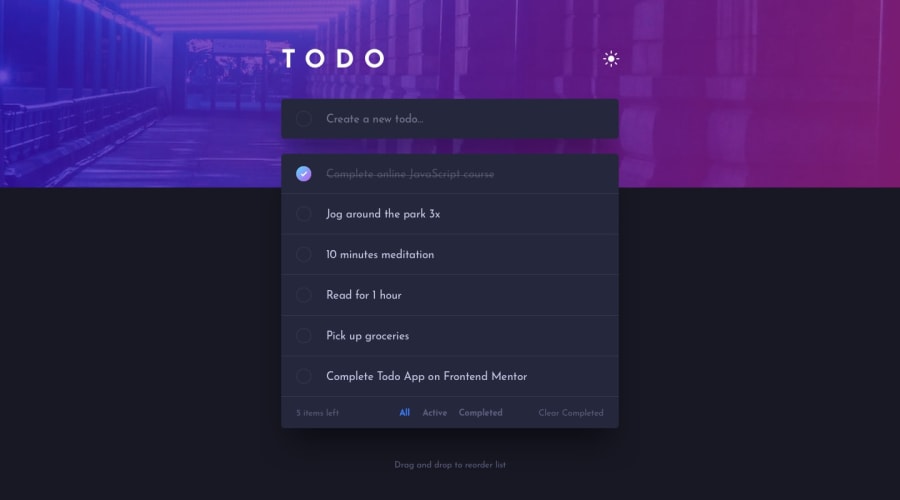
Todo App using Sortable.js, Toasts notifications, Local Storage, Saas.
Design comparison
Solution retrospective
Hello👋!
It's been a while since I put on the last challenge. I had to take a break but I hope my code isn't rusty after this time. The challenge was fun and I decided to have a little fun with additional options such as:
- Todos and theme are stored in Local Storage.
- Drag and drop to reorder items using library Sortable.js. Reordered items are also stored in Local Storage.
- When the list is empty, or there is nothing to display in the "Completed" tab, I was missing the information that there was nothing to display. I added it.
- I created a toast notification pop up in various events. (Adding todo / incorrectly entered input / Removing todo / clearing all.)
No specific questions here but any additional feedback will be appreciated!
Thanks! 😁
Community feedback
- @karenefereyanPosted over 3 years ago
Lovely one. I don't seem to be able to complete a task. Im thinking that clicking on a to do item should complete It. But it doesn't seem to work.
1P@tedikoPosted over 3 years ago@karenefereyan Thank you! What browser/device you're talking about? On mobile you have to click twice to make task completed since first click is making whole item hover and display remove button.
0 - @ApplePieGiraffePosted over 3 years ago
Hey there, tediko! 👋
I hadn't noticed you complete another challenge! 😅 It's nice to see you back and you've done such a great job on your solution! 🙌 Everything works really well and the toast notifications that you added are such a nice touch! 🤩 The animations are great, as well! 👍
Of course—keep coding (and happy coding, too)! 😁
1P@tedikoPosted over 3 years ago@ApplePieGiraffe Hello, APG. Thank you very much. It's nice to see you too! Congratulations on reaching 20000 points!
1 - @brasspetalsPosted over 3 years ago
Hi, tediko! 👋
I just saw you on the activity page and thought I'd drop in to say welcome back! Sorry I missed this last week. It's a great solution, and I love the UX/feel of all the transitions and animations. Very soft and smooth. 👍
I see you've made the correction Matt suggested, as everything worked perfectly for me when I tried navigating with the keyboard.
Definitely bookmarked for when I tackle this one! 😄
1P@tedikoPosted over 3 years ago@brasspetals Hello, Anna! It's nice you say that. Happy to be here, and to see known nicknames ;) See you around! Thanks.
0 - @mattstuddertPosted almost 4 years ago
Hey tediko, nice to see you back on the site posting a new solution! You've done an amazing job on this project and I like the extra details you've added like the animation and message when you remove a todo. It's great to see you adding proper focus states for the interactive elements as well.
One small thing I noticed while playing around is that if you toggle the checkbox while using your keyboard it doesn't update the todo as either completed or active. I'd recommend having a go at making the whole app work as expected without using a mouse/trackpad.
Keep up the great work! 👍
1P@tedikoPosted almost 4 years ago@mattstuddert Hi! Thank you for your feedback. Good to see you too. I must have broken the code somewhere because when I was doing these focus states i checked if i can make todo as complete using keyboard. I'll take a look at this problem! Thanks.
0 - @Sergio0831Posted almost 4 years ago
Did you use any library for animation?
1P@tedikoPosted almost 4 years ago@Sergio0831 No, i make them myself but instead of making them in CSS, I set them in JavaScript. Just so I can cancel them anytime and add new animation to same element.
0 - @Sergio0831Posted almost 4 years ago
Hi, I like your solution, Especially animation and alerts. This circle in input should be submit button. That what said in report about accessibility issues.
1P@tedikoPosted almost 4 years ago@Sergio0831 Hello! Thank you for your feedback. Indeed, that would be the perfect solution. After i saw this report I quickly thought to add a button but hide it with CSS and set preventDefault on it in JS.
0
Please log in to post a comment
Log in with GitHubJoin our Discord community
Join thousands of Frontend Mentor community members taking the challenges, sharing resources, helping each other, and chatting about all things front-end!
Join our Discord
