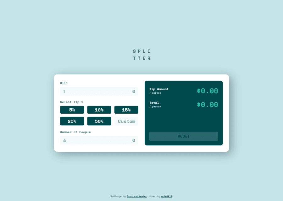
Design comparison
Solution retrospective
Hello everyone 👋
This is my tip calculator. I'm really happy that I've completed this challenge. It took me a long while and felt like a never-ending story 😅 When I thought it's finally done, I suddenly noticed something that need fixing, adding or improving. But now it's finished 🥳 And it rounds the results correctly!
Something that proved quite challenging to me was making sure users can freely switch between buttons and custom field when choosing the tip percentage.
Another thing was structuring the form itself. I decided to have a header with visually hidden h1 that will provide the name to screen-reader users and an SVG that is hidden from screen readers and in turn provides the name to sighted users who don't see the heading. Seems a bit confusing but in makes sense to me at least. Yet I'm not sure if this is a good practice.
Another challenge were the error messages and making them accessible.
I added some small details to the calculator: I made sure the calculated values are rounded - as far as I can see in the design they are just truncated. Also I think there is no check for the custom field in the design, yet I made sure it's there.
Questions:
- While I'm happy that the calculator works, I'm unsure of the JS code quality. I know what I did there, but I worry that it's chaotic and there are too many variables. Is the code OK?
- Should I use a sanitizer for this one? Since the calculator accepts numbers and not strings, I didn't add a sanitizer but I'm not sure about it.
- Is it OK to have the visually hidden heading and SVG for sighted users only the way it was done here? Or does it go against good practices?
- Is it OK to have
filedset+legend+ hiddenlabelsor is this an overkill? - Is
inputmode="numeric"a good choice? If not, what should I use?
Community feedback
- @Victor-NyagudiPosted over 2 years ago
The HTML validator report states that
inputmodeis not supported in all browsers, so you can simply use<input type="number">.It works just as fine with whole numbers and decimals. That should remove the warning/info in the report.
Other than that, everything seems to be working fine, so good job on that. The solution is responsive and follows the design very well.
Nothing much to add here.
Marked as helpful0P@ania221BPosted over 2 years ago@Victor-Nyagudi Got it! I'll try using
<input type="number">and see how it goes. Thank you very much for you feedback, it's much appreciated 😊0
Please log in to post a comment
Log in with GitHubJoin our Discord community
Join thousands of Frontend Mentor community members taking the challenges, sharing resources, helping each other, and chatting about all things front-end!
Join our Discord
