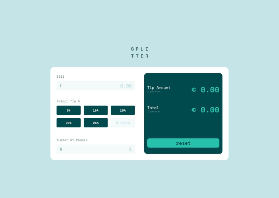
Design comparison
SolutionDesign
Solution retrospective
What are you most proud of, and what would you do differently next time?
Straightforward build, code is relatively clean I think. Put some effort in fixing details and refactoring the JS code as described in the article.
What challenges did you encounter, and how did you overcome them?Sometimes you loose time with the simple things (typos, linking a JS file etc.)
Community feedback
Please log in to post a comment
Log in with GitHubJoin our Discord community
Join thousands of Frontend Mentor community members taking the challenges, sharing resources, helping each other, and chatting about all things front-end!
Join our Discord
