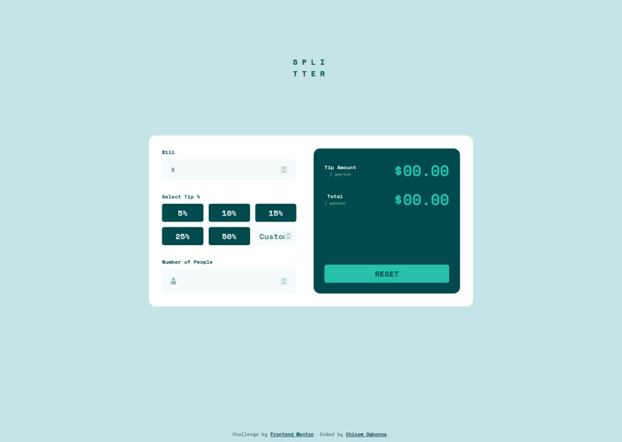
Design comparison
Solution retrospective
I enjoyed making this one, got to put my javascript skills to use and it came out wholesome. Any feedback is well appreciated!
Community feedback
- @tesla-ambassadorPosted almost 3 years ago
Hey Chisom! Congratulations on completing this challenge. It's really responsive and functional, I think you nailed most part of the design.
Here's a few pointers to help with your HTML validation issues and accessibility issues:
- In order to resolve some of your accessibility issues, you might wanna use landmarks in your html code, these help browsers easily navigate your code. So you might consider wrapping your divs in landmarks like
<main>or<header>or<footer>you need to do this according to how your page is structured. Incase you want to know more about landmarks, follow this link. - You might want to add labels to your form input elements, this enables the browser to properly identify the input elements within your form and it's also beneficial to people with using screen readers.
Happy coding and keep up the good work👍
Marked as helpful0@MavreonPosted almost 3 years ago@tesla-ambassador thank you so much for your feedback, made me feel so good about how far I've come... About 2 weeks ago I was struggling with making designs responsive but now I think I've gotten the hang of it.
1@tesla-ambassadorPosted almost 3 years ago@Mavreon You are very welcome! I am glad I could be of assistance and remember to just keep on pushing your limits! 💪
Marked as helpful1 - In order to resolve some of your accessibility issues, you might wanna use landmarks in your html code, these help browsers easily navigate your code. So you might consider wrapping your divs in landmarks like
Please log in to post a comment
Log in with GitHubJoin our Discord community
Join thousands of Frontend Mentor community members taking the challenges, sharing resources, helping each other, and chatting about all things front-end!
Join our Discord
