Design comparison
SolutionDesign
Solution retrospective
What are you most proud of, and what would you do differently next time?
- Getting the logic to work.
- Learning about the aria attribute for screen readers.
- Refactoring the code to reduce repetition. Reading more on refactoring helped, however, I believe more refactoring is possible.
Any feedback on how I can further make the code simpler and more readable.
Community feedback
- @jamesbrown173Posted 9 months ago
Design:
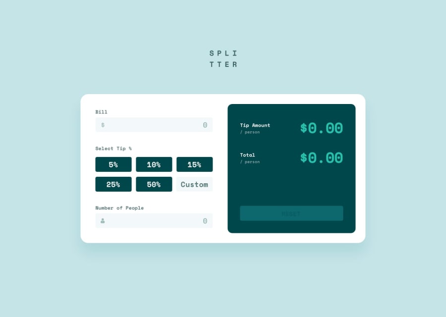
- The design is clean and easy to follow, I see you've made adjustments for your own styling that's great. All items align well and use correct icons.
- When hover over the custom tip input the added border makes the div jump up and down. You could fix this by adding a 'fake' border that is the same color as the background in line 31 of index.hmtl.
- Site is responsive to all screen sizes.
- On the mobile size the background blue color is only applied to the div container not the body, so it leaves white padding on the L and R. I think you could either apply the BG color to the body or remove X padding to fix this line 13 index.html.
Javascript code:
- Clean, easy to follow.
- Could be improve with some comments for each section.
- Functions well to calculate the amounts.
- As far as I can tell the bill only calculates when the tip inputs change, you could at an event listener for 'keyup' to the people and bill elements if you want it to be more responsive and change whenever a user types. You'd also need to add conditional statements to prevent submission if one or more fields were empty.
🤗 Great job and happy coding! 🤗
1@khalagaiPosted 9 months ago@jamesbrown173 thank you so much for the guidance. Let me take up the challenge.
1
Please log in to post a comment
Log in with GitHubJoin our Discord community
Join thousands of Frontend Mentor community members taking the challenges, sharing resources, helping each other, and chatting about all things front-end!
Join our Discord
