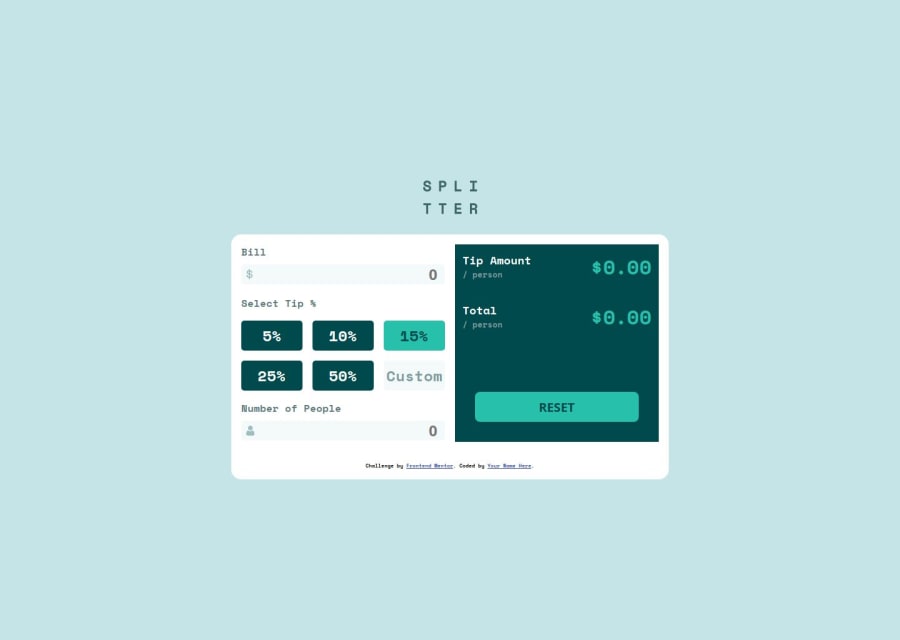


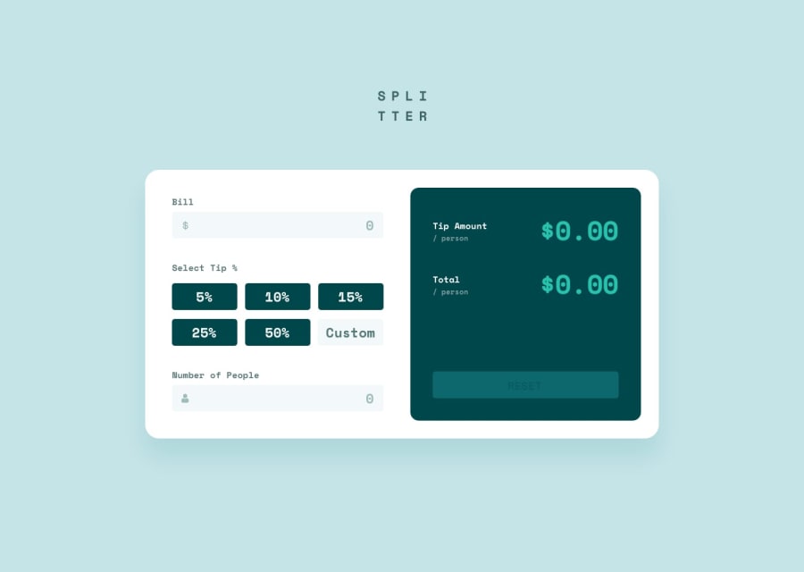
Design comparison
Solution retrospective
I tried to abide by the DRY principle and was able to simplify the validation and error handling, I think.
What challenges did you encounter, and how did you overcome them?I found implementing the tip choice GUI was challenging. I used radio buttons to implement the choices so that only one can be selected. I had to hide the radio button, however, by setting its display style to none. I can still select it by clicking its label, but I was not able to select it by keyboard. So I am not sure if my solution was acceptable.
What specific areas of your project would you like help with?I would like to hear suggestions on how to implement the tip choice GUI. Can I use radio buttons and make them visually hidden, and still be responding to the keyboard?
Community feedback
- @7osny13Posted about 1 month ago
very nice project
0

Please log in to post a comment
Log in with GitHubJoin our Discord community
Join thousands of Frontend Mentor community members taking the challenges, sharing resources, helping each other, and chatting about all things front-end!
Join our Discord