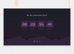
Design comparison
Solution retrospective
I would love to hear your opinions about it. I know the flipping animation approach is not the best one, I would love to know better ideas. Thanks.
Community feedback
- @tedikoPosted over 3 years ago
Hello, Ahmed basset! 👋
Good job on this one! Your solution responds well and overall looks good. I've recently finished this challenge too and it was really hard to make this flip animations so kudos for that. Take a look at my solution. I used
backface-visibilityproperty. This property defines whether or not the back face of an element should be visible when facing the user. So when i rotate my cards, back of them isn't visible to the user so I can create this nice flip animation. And also usedperspectiveCSS property to give cards "3d" effect.- Take look at bottom half of your
.card-back-text. It is changing before card flip. It should change after card is flipped.
Good luck with that, have fun coding! 💪
1 - Take look at bottom half of your
- @RahulKumarGautam1636Posted over 3 years ago
Just missing the perspective property use it, will look very nice.
0@aabdulbassetPosted over 3 years agoHello, I tried the perspective property but it didn't help, it still looked flat as a plank. I suspect the issue is in overflow:hidden property. if you don't think that this is the issue please guide me to what would be, and how to fix it.
0
Please log in to post a comment
Log in with GitHubJoin our Discord community
Join thousands of Frontend Mentor community members taking the challenges, sharing resources, helping each other, and chatting about all things front-end!
Join our Discord
