Time-tracking-dashboard_TypeScript_Html_Css-Scss-Bem_Responsiv


Design comparison

Solution retrospective
- Clear Interface and Enum Definitions The use of interfaces (Activity, Timeframes, TimeframeData) and enums (Timeframe) demonstrates a well-structured approach to data modeling. This improves code readability and maintainability, while also enforcing type safety throughout the application.
- Asynchronous Data Fetching The fetchData function uses async/await syntax for handling asynchronous operations. This results in cleaner, more readable code compared to nested callbacks, and makes error handling more straightforward.
- Separation of Concerns Functions like updateDashboard, setTimeframe, and displayError each have a single, clear responsibility. This adheres to the Single Responsibility Principle, making the code easier to understand, test, and maintain.
- State Management The use of a global currentTimeframe variable and the setTimeframe function shows a simple but effective approach to state management, ensuring that the application's state is consistently updated and reflected in the UI.
- Flexible and Reusable Code Functions like getTimeframeText demonstrate how the code is designed to be flexible and reusable. This reduces code duplication and makes future modifications easier.
- Use of Modern JavaScript Features The code leverages modern JavaScript features like template literals, arrow functions, and optional chaining. This results in more concise and readable code.
- Consistent Code Style The code maintains a consistent style throughout, which is crucial for readability and maintainability, especially in team environments.
- I added modern CSS animations to enhance the overall user experience.
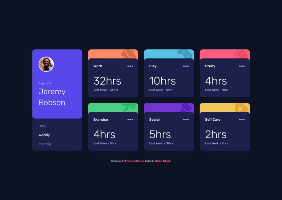
At the beginning, I coded the cards using a mix of grid for the overall layout and relative/absolute positions for overlapping the cards. It turned out that mixing these two layout algorithms made the responsive design extremely complex to manage. I had to break down all my code and redo it with a different approach. It was a real challenge for me to find the right arrangement of the elements.
What specific areas of your project would you like help with?Again, if a TypeScript expert comes across this, you can find my file here: src/home.ts. I would appreciate feedback on the code. Thank you in advance. Feel free to add me on GitHub and LinkedIn to connect if you wish; just visit my profile. See you soon and happy coding.
Community feedback
- P@juliusalbertoPosted 8 months ago
This is a really good solution! I like how you stick with grid from the start - I used flex for my mobile design and grid for my desktop and it's making the media query a bit complicated.
You also have several breakpoints, which is nice. I also like the motion that your card gives when I hover on top of it - super nice. Overall a good design. The code is well structured (at least I can read it). Top notch!
1

Please log in to post a comment
Log in with GitHubJoin our Discord community
Join thousands of Frontend Mentor community members taking the challenges, sharing resources, helping each other, and chatting about all things front-end!
Join our Discord