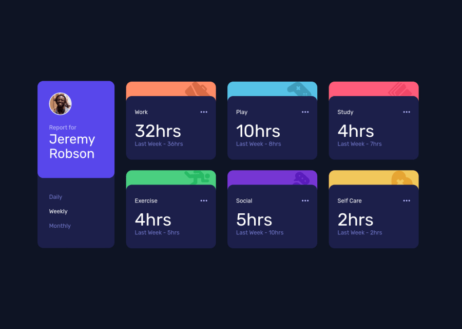
Time Tracking Dashboard with Next.js/React/TailwindCSS
Design comparison
Solution retrospective
Hello all,
I would mainly want to know if the styling could be improved. Any other feedback is also welcome of course :D
All issue's displayed on Frontend Mentor are related to Next.js, if there are also tips on how to remove them please advise.
Community feedback
- @markteekmanPosted over 3 years ago
Nice one Mike!
Looks really great and some great suggestions by Dharmik48 already :) Some additions:
- You can also improve the design a little more by setting the ProfileCard width to 20% to make it resemble the original design a little more.
- There's an error in the console about an uncaught promise, but maybe that's also a Next.js thing because switching the stats does work.
Keep up the good work!
Marked as helpful2 - @Dharmik48Posted over 3 years ago
Hey👋,
-
Around
745pxthere an issue with the layout. The first card is really squeezed with lots of empty space to the right of it. And the other cards are taking the full screen width. So have a looks at that. -
Also add some
transitionto the hover state.
Apart from these your solution is really good, keep it up👍
Marked as helpful1@MikevPeerenPosted over 3 years ago@Dharmik48 Hey Dharmik👋,
Thanks for the feedback, I have fixed/added your comments.
0 -
Please log in to post a comment
Log in with GitHubJoin our Discord community
Join thousands of Frontend Mentor community members taking the challenges, sharing resources, helping each other, and chatting about all things front-end!
Join our Discord
