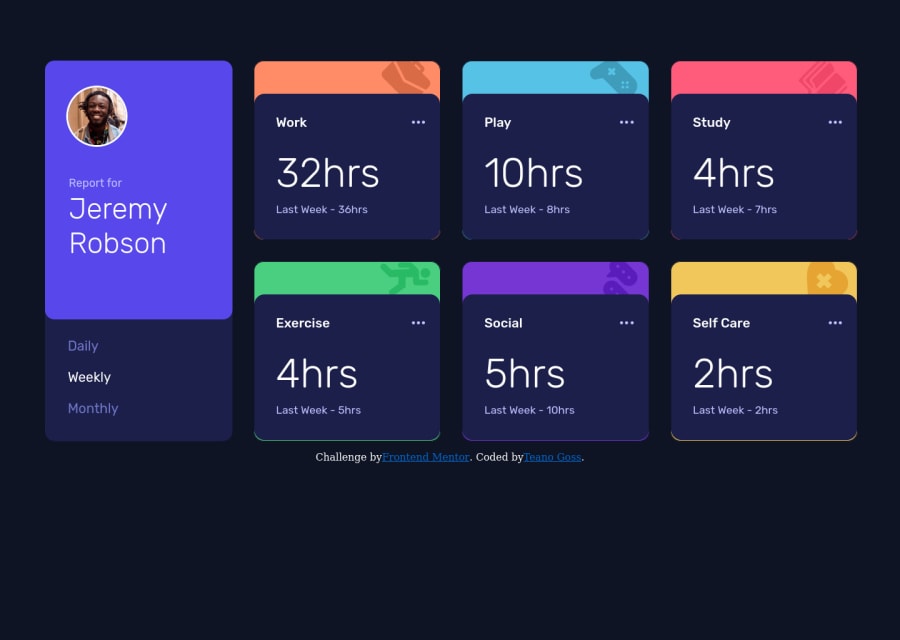
Time Tracking Dashboard - Utilizing neat CSS tricks and JavaScript
Design comparison
Community feedback
- @SuhodolecAPosted about 3 years ago
Hello! Nice work! You could improve your solution using transition property for interactive elements. For example: .menu-link { margin-left: 0.9rem; cursor: pointer; transition: color 0.3s linear; } .menu-link:hover { color: hsl(0, 0%, 100%); } It gives you smooth animation.
Also, you can add cursor: pointer property for .regular-card element. And you could resolve problems with cards(parent background is visible when resizing page) using :
- For parent overflow: hidden;
- For child height: 100% Like this: .regular-card { border: 1px solid var(--Very-dark-blue); border-radius: 0.8125rem; background-repeat: no-repeat; background-position: 93% -0.7rem; cursor: pointer; overflow: hidden; }
.data-card { position: relative; background-color: hsl(235, 46%, 20%); border-radius: 0.8125rem; padding: 1.75rem 1.5rem 1.8rem 1.5rem; margin-top: 2.4375rem; height: 100%; }
Good luck!
Marked as helpful1P@tcaturani-gossPosted about 3 years ago@SuhodolecA Anton, you are amazing that definitely helped me tighten up the design when resizing to different devices in the developer tools window and the transition on my menu links looks super clean now, thank you so much!!!
0
Please log in to post a comment
Log in with GitHubJoin our Discord community
Join thousands of Frontend Mentor community members taking the challenges, sharing resources, helping each other, and chatting about all things front-end!
Join our Discord
