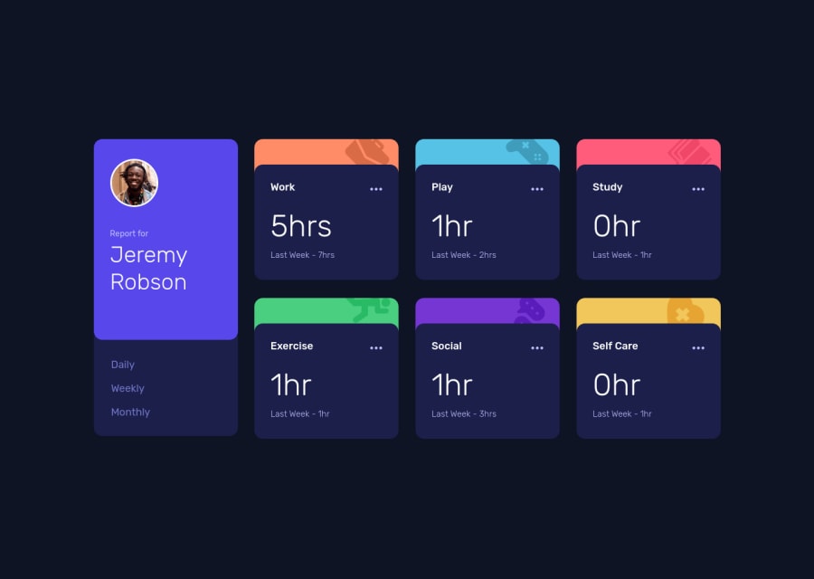
Time Tracking Dashboard using React + TypeScript
Design comparison
Solution retrospective
First time using Redux and ViteJs!
If you have some feedback about my solution feel free to comment below! =)
Community feedback
- Account deleted
Hi there 👋 Congratulate on finishing your project 🎉. You did a great job 🔨
I give some suggestions that I hope help you take your project to the next level 📈. I found one responsibility issue. On I pad mini size 768/1024 your design is crashing. Maybe you can fix it 👍
Happy coding ☕
Marked as helpful1@kdumagalhaesPosted about 3 years ago@maqsudtolipov Thank you! I'm gonna fix it! =)
Happy coding for us!
1 - @UDsGitHubPosted about 3 years ago
Hey Kadu, just saw your solution and it looks great. The one issue I found, was that it seems as though your main profile component isnt in the same container as the time tracking components as such, when the screen width changes below 1100px, it starts to break and look off.
Good luck with that, Id suggest having both the profile and the.... dont mind me. I just looked at the divs in your code and noticed I have said a bunch of stuff right now. Yeah so basically, your profile needs to be able to stretch with the rest of the components and look decent while at it.
Good luck 👍
1@kdumagalhaesPosted about 3 years ago@UDsGitHub thank you so much! I've fixed it and now is working better on mobile screens! =)
0
Please log in to post a comment
Log in with GitHubJoin our Discord community
Join thousands of Frontend Mentor community members taking the challenges, sharing resources, helping each other, and chatting about all things front-end!
Join our Discord
