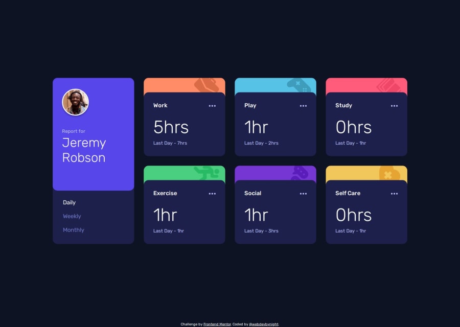
Time tracking dashboard solution - HTML, SCSS, TypeScript, Fetch, RWD
Design comparison
Solution retrospective
I learnt the way of building a grid layout with the keyword auto-fit. I thought it would be complicated to use it, but it is as easy as to use the repeat() function, where such a keyword is used. Combined with the use of the clamp() function to define the grid container width, I managed not to multiply media queries.
I wondered how I would translate the coloured top banner of each card into code in a efficient way. By testing with a pseudo-element and a grid layout, I realised that grid layout, like flexbox, included the pseudo-elements attached to the grid container in the elements to which the grid effects applied.
What specific areas of your project would you like help with?Do not hesitate over giving feedback about accessibility if there are improvements in the way I use aria-live, and about my TypeScript if there are improvements to make the code I wrote more performant.
Community feedback
- @AymaneOnlinePosted 5 months ago
Good job, I like how you didn't forget the
focus effectof the Daily button when the page is loaded on the first time.0
Please log in to post a comment
Log in with GitHubJoin our Discord community
Join thousands of Frontend Mentor community members taking the challenges, sharing resources, helping each other, and chatting about all things front-end!
Join our Discord
