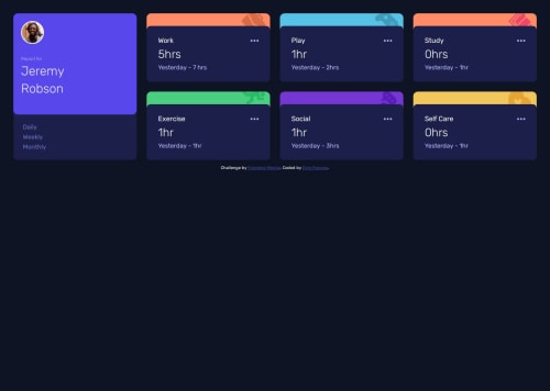
Submitted about 1 year agoA solution to the Time tracking dashboard challenge
Time Tracking Dashboard
sass/scss
@Ejiro-Frances

Solution retrospective
What are you most proud of, and what would you do differently next time?
I am proud of the project outcome.
What challenges did you encounter, and how did you overcome them?Challenges include:
- Using the json file. I did not eventually use it and I would learn more on how to use it.
- converting font size from px to rem in sass was a bit tricky as '/' was an issue. I used sass maths instead.
- I was unable to use grid-areas in Sass. A solution to this would be greatly appreciated.
- I would also like a code review with pointers on how to improve my code.
- Finally, I'm wondering if it's possible to use wrap in grid or if I have to use auto-fit or minmax?
Code
Loading...
Please log in to post a comment
Log in with GitHubCommunity feedback
No feedback yet. Be the first to give feedback on Ejiro Frances's solution.
Join our Discord community
Join thousands of Frontend Mentor community members taking the challenges, sharing resources, helping each other, and chatting about all things front-end!
Join our Discord