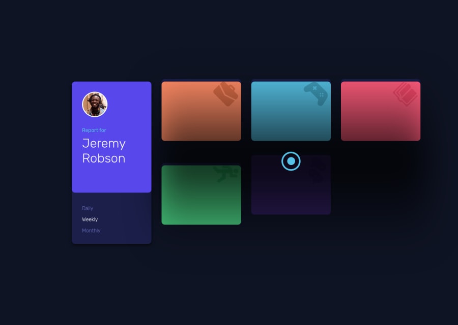
Design comparison
Solution retrospective
Hello again! Let me know what to fix on the semantics and accessibility~ 😀
Any other feedback is very much welcome too! 😁
By the way, I have no idea what the three dots does so I just assume it should be toggling a popup or something hence, the attributes on it. (I didn't create any popup so nothing will appear when you click it 😂)
Community feedback
- @bramuccciPosted over 3 years ago
wow, the animations are amazing 😦 I love this! The only I noticed is that the card in small devices (less than 375px) isn't very responsive, but great solution anyway
Marked as helpful0@A-amonPosted over 3 years ago@Liltanie Thank you! Glad you like it~ I will look into a fix for it 😀
1 - Account deleted
It actually looks pretty good and the starting animations gives it something unique, & I think you have something set to
overflow : hiddenbecause on mobile I can not scroll vertically.Marked as helpful0@A-amonPosted over 3 years ago@thulanigamtee Oh! Thanks for letting me know~ I missed that.😂
0 - @sivakotariPosted over 3 years ago
Fabulous. Great work!!
0@sivakotariPosted over 3 years ago@A-amon Noticed that the section heading is not updating based on the selected time frame
Marked as helpful0@A-amonPosted over 3 years ago@sivakotari Awesome! That's quite a sharp observation~ 😂 I have fixed it. Thank you!
0
Please log in to post a comment
Log in with GitHubJoin our Discord community
Join thousands of Frontend Mentor community members taking the challenges, sharing resources, helping each other, and chatting about all things front-end!
Join our Discord
