Time Tracking Dashboard

Solution retrospective
Starting this challenge was fun! I really enjoyed manipulating the DOM.
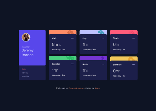
A PLOT TWIST The user tests my work (the page) with a slow network.... haha! there is a spinner to indicate that information is being loaded in the background and when it has arrived , it gets displayed on the screen at its respective position and spinner gets hidden. This way the user does not get annoyed and leave the awesome page 🤗
This spinner provides a hint to the user that his network is slow and the page works perfectly so he can stop clicking my buttons 😂😂
I also added a click effect to the buttons so that a user can know that he clicked the button already.
FEEDBACKS ARE WELCOME, THANK YOU!!! I love you all ♥
Please log in to post a comment
Log in with GitHubCommunity feedback
No feedback yet. Be the first to give feedback on Nonye's solution.
Join our Discord community
Join thousands of Frontend Mentor community members taking the challenges, sharing resources, helping each other, and chatting about all things front-end!
Join our Discord